Disclosure: I’m long GlaxoSmithKline plc (GSK), Gilead Sciences, Inc. (GILD)
Summary
• Slow growth is projected (I’ve made numeric projections of core EPS based on GSK’s statements).
• The record of approvals from the FDA suggests upside in the pipeline, but that needs to be weighed against the risk to the dividend.
• The Novartis “put” option for the consumer business is booked as a liability without recognizing the benefit of buying out Novartis.
• Growth of the consumer business could increase the liability for the “put” option.
• A large number of miscellaneous points complicate the investment case.
About this piece
GSK seemed like an undervalued stock but as I researched I found a few more negative points than positive, and a lot of complication. I see too much risk for any margin of safety, and this long piece is not a good use of time for investors who just want to find good investments. I’ve listed the 58 headings here, which might help some readers find their way around.
The company and stock
GSK is a large British healthcare company with international operations and revenue, split between Pharmaceuticals (59%), Vaccines (16%), and Consumer Healthcare (25%) (2014 sales restated to reflect a shake-up). Morningstar put “ADR” after the company name, while Seeking Alpha have “NYSE” after the name and stock ticker. This UK broker’s site says each ADR represents two ordinary shares.
Big changes
Andrew Witty became CEO on May 21, 2008, and from about 2008 to 2011 R&D staff were reorganized into small teams, designed to mimic the nimble and entrepreneurial nature of small bio-tech companies. Annual reviews could result in projects being stopped and teams broken up. There have been reasons to be sceptical about the “small teams” structure, which I outline under “Negative articles” further down. The quantity and quality of approvals from the U.S. Food and Drug Administration (FDA) in recent years are evidence of the change working, but there have also been failures. Pharma sales have been hit by patent expiry, and GSK’s big seller Advair has patent expirations and has had pricing pressure.
A deal completed in March 2015 meant Novartis got GSK’s oncology business while GSK acquired vaccines from Novartis. GSK and Novartis also pooled their consumer healthcare products into a joint venture, where GSK has control with 63.5% of the equity. The joint venture combines GSK’s sales capability in emerging markets with Novartis’s in Central and Eastern Europe and CIS (a trading bloc with old Soviet Union countries). The deal was immediately dilutive to earnings.
Some of the expected cost savings have already been realized, through eliminating duplication in sales, admin, and infrastructure, through less need of third party contractors, and other economies of scale. Sales of consumer products and vaccines don’t fall off a cliff when patents expire, so making those segments bigger should provide some long term stability (vaccine sales are lumpy, so they won’t reduce short term variability).
GSK still has oncology products in the pipeline, and they were not offered to Novartis. At least six of them are planned to receive approval in 2018 to 2020, and oncology is one of six areas GSK say they are focused on – HIV/Infectious Disease, Respiratory, Vaccines, Oncology, Immuno-inflammation and Rare Disease. Novartis get “first refusal” on new oncology drugs but they can’t stop GSK from commercialising oncology drugs themselves or accepting a better offer.
Sales and innovation breakdown, and Rx/Cx switching
The figures are from the Financial outlook and guidance presentation, 6 May 2015. They are “pro forma” 2014, as if the Novartis transaction had been completed before 2014.
Sales by geography
US 30%
EU 29%
International 41%
Sales by segment
Pharma 59%
Vaccines 16%
Consumer healthcare 25%
Segment innovation
GSK use “Rx” for prescription medication, “Vx” for vaccines, and “Cx” for consumer healthcare. A chart headed “Balanced innovation” gives:
Vx 3, Rx 8, Cx 10%+ Innovations sales.
The Vx and Cx numbers are explained with –
“Includes key recent and near-term launches plus late-stage assets. Rx: Breo, Anoro, Incruse, Arnuity, Tanzeum, Nucala. Tivicay, Triumeq, Vx: Menveo, Bexsero, Shingrix”
From the associated transcript –
“innovation sales being products that were launched on a rolling basis in the last three years. But sometimes that number will spike, as it has done in the first quarter this year, especially if you are able to switch a product from prescription to over the counter.”
Advair and generics
The patent has expired in Europe, where the product is known as “Seretide” in most countries (see Wikipedia’s “Fluticasone/salmeterol“). In the USA the diskus device patent expires in 2016, while the HFA-device expires 2015-2026 (according to the table “Pharmaceutical products, competition and intellectual property” in the annual report for 2014). The diskus device is a dry powder inhaler and “HFA” is an inhaler propellant.
In 2014, sales of the Seretide/Advair respiratory products were down 15% to £4,229 million, which was 18.4% of “Turnover” (revenue).
GSK’s guidance assumes some impact from generics. The impact is hard to predict, because replication of Advair is not easy, but not impossible either. From the Q3 results transcript, about Advair –
“we have seen a lot of price pressure and we have seen increasing generic competition ex-US in emerging markets and, to a lower degree, in Europe.”
Generic manufacturers seem to have a problem either in making a close copy of Advair, in controlling quality, or at least in getting FDA approval. From the Q3 results transcript, about Advair in the US –
“If you project forward and look at the average review times of the FDA and all of those, particularly given that this is a reasonably complicated product to generate a generic for, to state the obvious, it seems unlikely to me that this would go very quickly. Could it conceivably start sometime in 2017? Conceivably, yes. Could it be later than that? Yes. Could it fail? Yes. So, unfortunately, I am not really the man to help you too much. What we have tried to do to help you is what we said back in May, when we gave you an indication of how we saw the growth rate of the company running all the way through to 2020, essentially to signal to you that in that period when we dialled in, just for the purposes of that assumption, a genericisation in America, it reassured us that, even if we do have a genericisation of America during that period, we can deliver good, solid, sustainable sales growth and earnings growth for the company between May 2015 and 2020.”
IMO the statement suggests more upside from slower generic competition, than downside from faster generic competition, compared to GSK’s assumptions about Advair, but I have not seen the exact assumptions so I can’t be sure. Sales have declined in the US due to price reductions agreed with the giant Pharmacy Benefit Manager (PBM) Express Scripts, which got Advair back on the “preferred” list, see “Note to Big Pharma: Discounts work. GSK price cuts score Advair a payer boost” by Carly Helfand, August 5, 2014 (fiercepharma.com). From the Q3 results transcript –
“US Pharma sales were down 10% proforma, primarily driven by Advair which was done 18%. It is down 19% year-to-date as we absorb the price reductions we agreed last year, but also as we transition our portfolio to the new products.”
The price cut was forced, but it reduces the incentive to generic manufacturers to get an FDA-approved copy of Advair.
GSK mention “the sales decline in Advair/Seretide of £182 million in the quarter.”. The decline isn’t over – “despite the continued decline of Seretide/Advair sales”, but it’s slowing, “you will see a continued reduction in Advair price in the US in terms of the net price that we are charging, but the rate of decline is decelerating.”.
“As far as Seretide in Europe is concerned, essentially we’re continuing to see generics launch in different countries. The bottom line is that, with a few exceptions, the generics are taking relatively low volume shares, so perhaps 3-5% market shares. Most of the hit – not all as there is clearly a volume hit as well – is price that we are taking and we are taking price to retain share in a number of countries. However, I would fully expect that pressure to continue.”
Other competition from generics
From the Q3 results transcript (my bold) –
“Avodart going generic in the US at the start of Q4″
“The overall decline in the US was also affected by a continuing tough comparator for Lovaza which was down 66% post the introduction of generics last year. The business had £44 million of sales in Q4 last year, so this will continue to be a headwind into the fourth quarter.”
There’s patent expiration info for the top four sellers under “Legal proceedings”, below.
After Advair
“As you then rotate through the potential generic Advair scenario, one way or another, as I have described, and you look at our business the other side of that – wherever you choose to put that window. If you look at the business on the other side of that, you have a business where there is no material intellectual property rights threat to the company’s portfolio until 2026/27.” (Q3 results transcript)
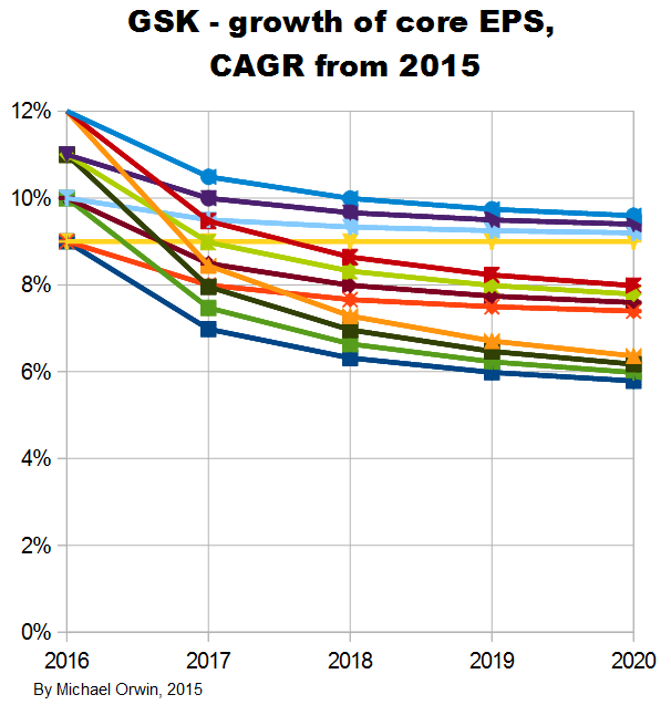
GSK’s statements about core EPS and its growth
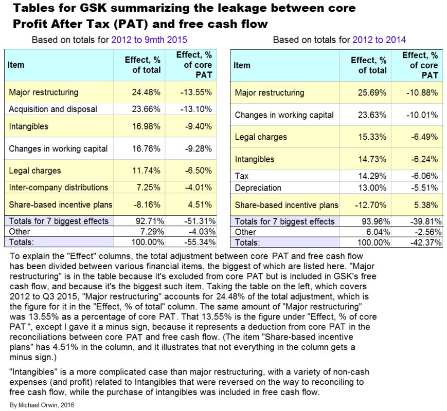
GSK expect core EPS to dip and then grow. That’s partly the result of products coming off patent while new products gain traction, and also because the deal with Novartis was earnings dilutive, but with cost reductions accumulating until 2017. Core results exclude –
“amortisation and impairment of intangible assets (excluding computer software) and goodwill; major restructuring costs, including those costs following material acquisitions; legal charges (net of insurance recoveries) and expenses on the settlement of litigation and government investigations, and acquisition accounting adjustments for material acquisitions, disposals of associates, products and businesses, other operating income other than royalty income, and other items, together with the tax effects of all of these items.”
My projections are based on statements like “CAGR of mid-to-high single digits”. The figures for EPS depend on core EPS for 2014, which is 95.4p in the annual report. The basic EPS and the diluted EPS were 57.3p and 56.7p, a lot less than the core EPS. The figure is also in this quote from a transcript –
“The flexibility we have built into our cost base in recent years enabled us to respond quickly and effectively to these challenges during the year, so that we were able to deliver core EPS of 95.4 pence, down 1% on an ex-divestment constant currency basis despite a top line decline of 3% on the same basis.” (q4-2014-analyst-presentation-transcript.pdf)
I’ve stuck to British currency, and 95.4 pence is also 95.4p or £0.954, or $1.44 (USD).
These quotes from the Q3 2015 results announcement give the percentage change expected. CER is Constant Exchange Rate. I’ve made the most relevant words bold –
“Guidance for 2015
Core EPS for 2015 is expected to decline at a percentage rate in the high teens (CER), primarily due to continued pricing pressure on Seretide/Advair in the US/Europe, the dilutive effect of the Novartis transaction and the inherited cost base of the Novartis businesses. The 2015 guidance excludes potential income from the proposed divestment of ofatumumab, which was announced on 21 August 2015. The Group now intends to treat income generated from the proposed divestment as a non-core item, as set out on page 45.”
“2016 outlook
In 2016, GSK expects to see a significant recovery in core EPS with percentage growth expected to reach double digits on a CER basis as the adverse impacts seen in 2015 diminish and the sales and synergy benefits of the Novartis transaction contribute more meaningfully.”
“At its Investor Day on 6 May 2015, GSK outlined a series of expectations for its performance over the five year period 2016-2020. This included an expectation that Group core EPS would grow at a CAGR of mid-to-high single digits on a CER basis. The introduction of a generic alternative to Advair in the US was factored into the Group’s assessment of its future performance. The Group also stated its intention to pay an annual ordinary dividend of 80p for each of the next three years (2015-2017). For more information see:” gsk.com/en-gb/investors/investor-event
The CFO has said “we will see variation year to year around those averages” (Financial outlook and guidance, May 6, 2015, transcript).
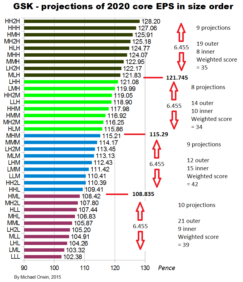
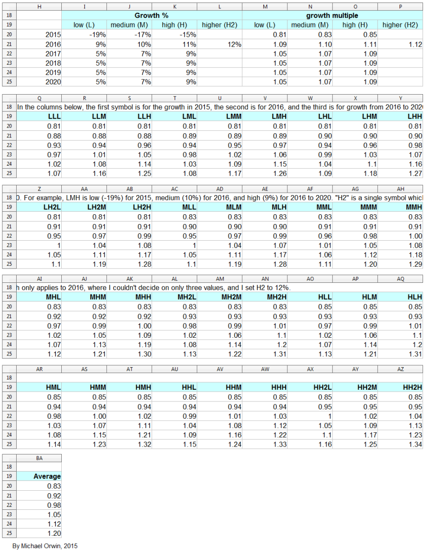
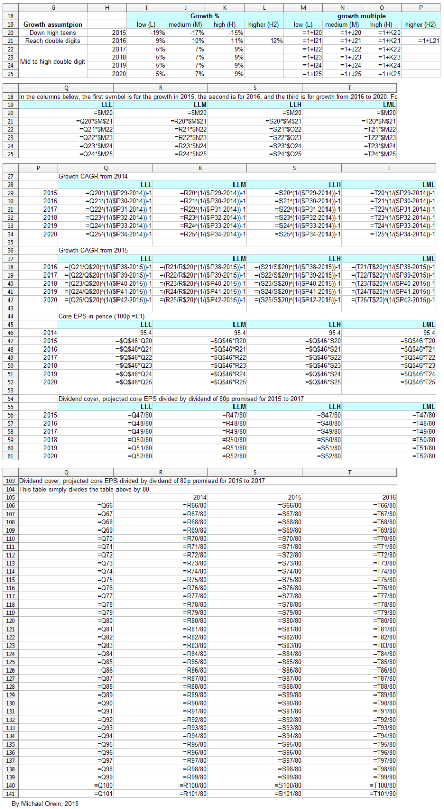
GSK’s words translated into figures
I’ve made low, mid and high assumptions, which I put into a spreadsheet.
low ~ mid ~ high
2015, “decline at a percentage rate in the high teens”
-19% ~ -17% ~ -15%
2016, “percentage growth expected to reach double digits”
10% ~ 12% ~ 14%
2016-2020, “CAGR of mid-to-high single digits”
5% ~ 7% ~ 9%
Low, mid, high and probability
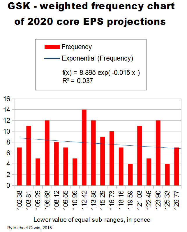
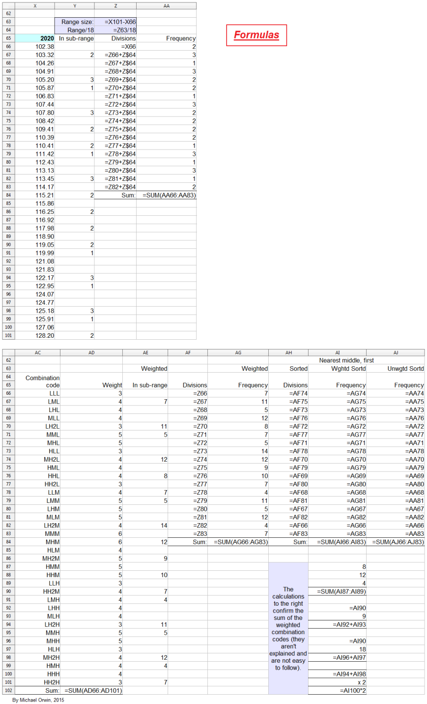
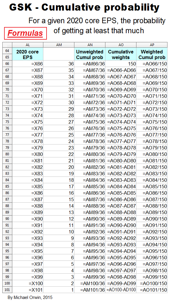
In the spreadsheet, the “low” outcome for core EPS assumes all three low cases. If low, mid and high were all equally likely (for the actual core EPS to be closest to), then the probability of all three cases being low is only 0.037, or 3.7% (assuming the cases are independent). That’s also true for “mid” and “high”. I’d guess there’s at least 90% probability of the 2020 EPS being between the low and high values shown, with figures near “mid” more likely, but this is fundamentaly not a rigorous statistical excercise due to reliance on GSK’s statements and translating the words into low, mid and high cases.
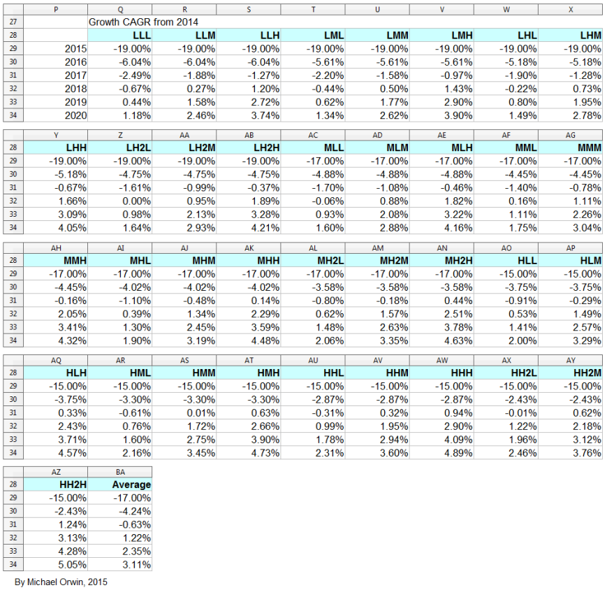
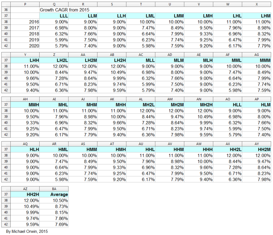
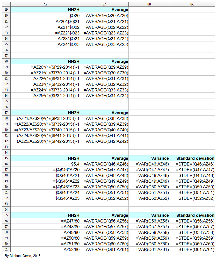
The spreadsheet
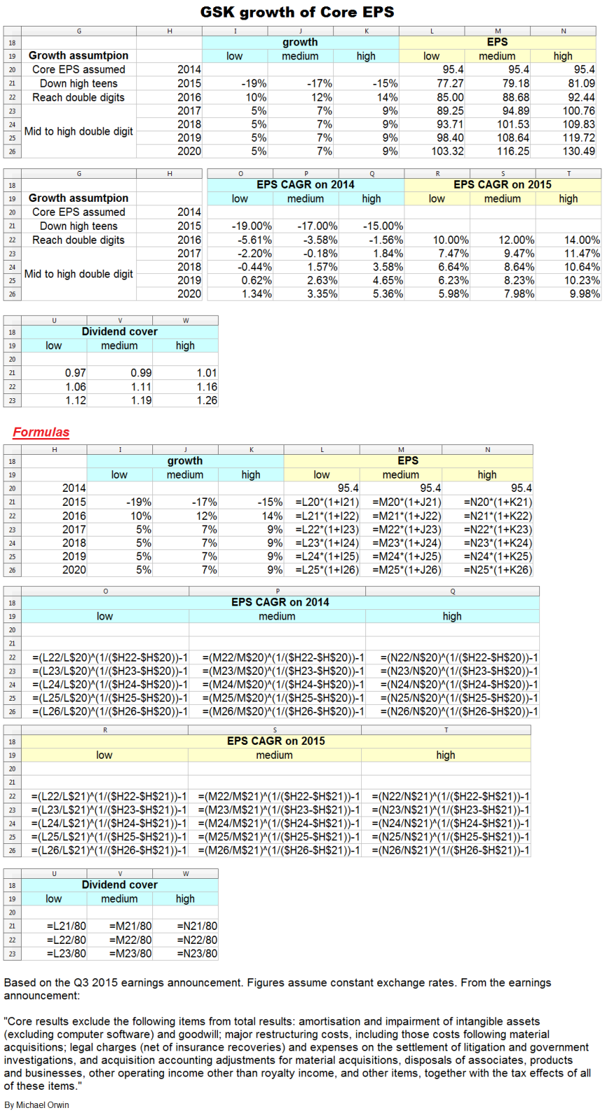
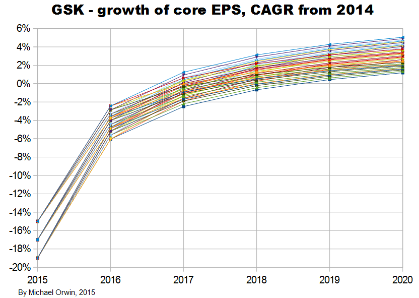
The resulting CAGR of core EPS for 2014 to 2020 is:
low ~ mid ~ high
1.34% ~ 3.35% ~ 5.36%
I also tried reducing the 2016 assumed growth (“percentage growth expected to reach double digits”) to 9%, 10% and 11%, with the results:
low ~ mid ~ high
Core EPS 2020
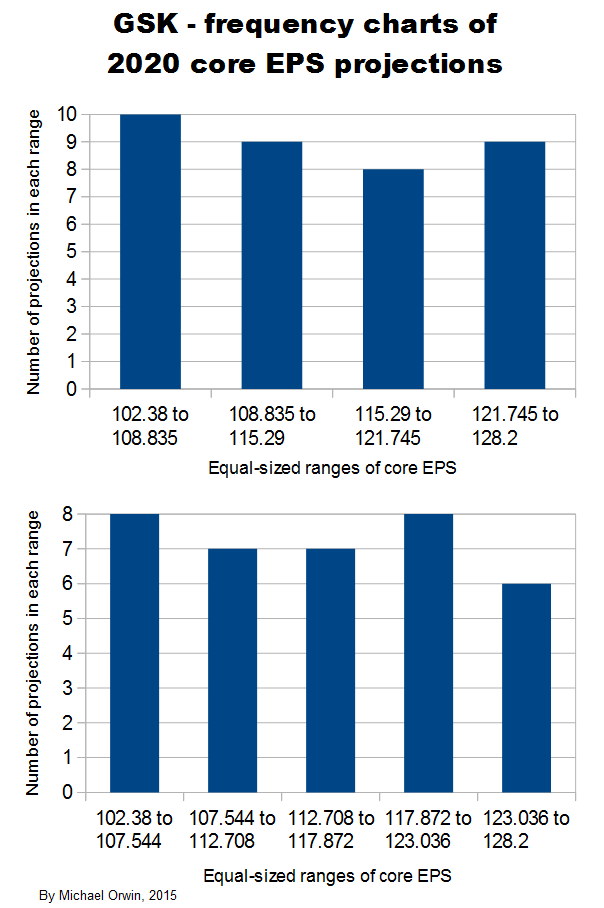
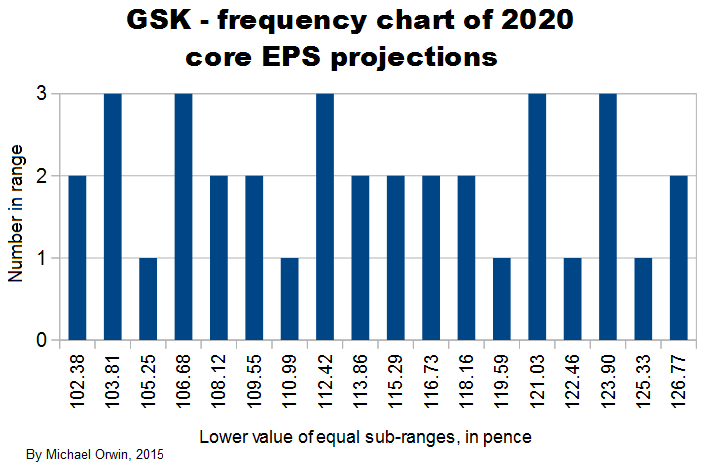
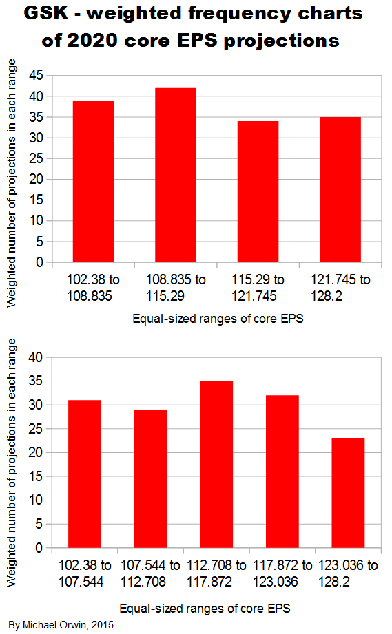
102.38 ~ 114.17 ~ 127.06
CAGR from 2014 to 2020
1.18% ~ 3.04% ~ 4.89%
CAGR from 2015 to 2020
5.79% ~ 7.59% ~ 9.40%
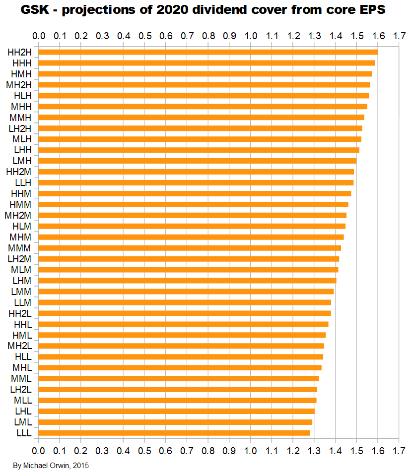
Dividend cover from core EPS
2015 0.97 ~ 0.99 ~ 1.01
2016 1.05 ~ 1.09 ~ 1.13
2017 1.11 ~ 1.16 ~ 1.23
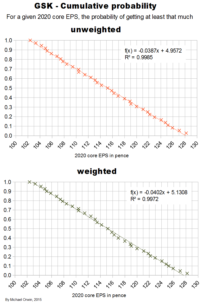
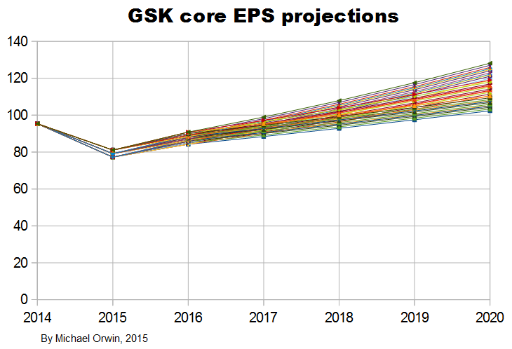
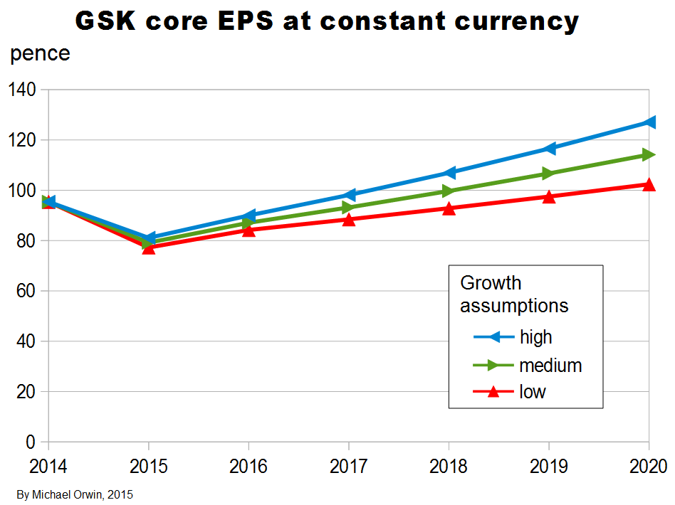
I’ve charted core EPS based on the lower assumptions for 2015 growth.

Core EPS and the dividend
The figures are hardly exciting, but there is at least the benefit of some growth in core EPS on top of the dividend.
The yield was 6.07% as at Dec 4, 2015. Based on “80p for each of the next three years” ($1.21) at the current share price of 1,319.50p (the “buy” price) ($19.94), there’s a 6.06% yield, which is in the future. There are complications, with the “future yield” slightly lower than the yield now, and a special dividend due for payment on April 14, 2016. (You can see the special dividend, share price, yield etc. on Hargreaves Lansdown. The 2014 EPS shown is 95.4p, which is GSK’s core EPS, not the Basic or Diluted EPS.)
Both the current and future yield I described are slightly above “US High Yield BB Effective Yield:” (ycharts.com), the second-highest grade (below BB+) for junk bonds (Wikipedia), where the risk is higher than for investment grade, and for bonds there’s no prospect of growth. Because transatlantic trade isn’t hard, the relative pricing suggests a lack of confidence in GSK’s ability to maintain the dividend. GSK’s debt is rated investment grade, see “Credit ratings” below.
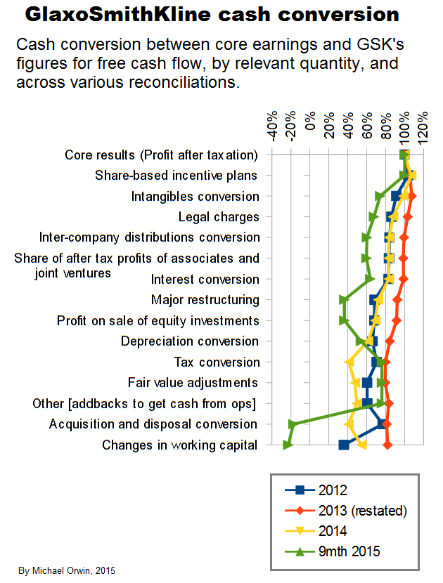
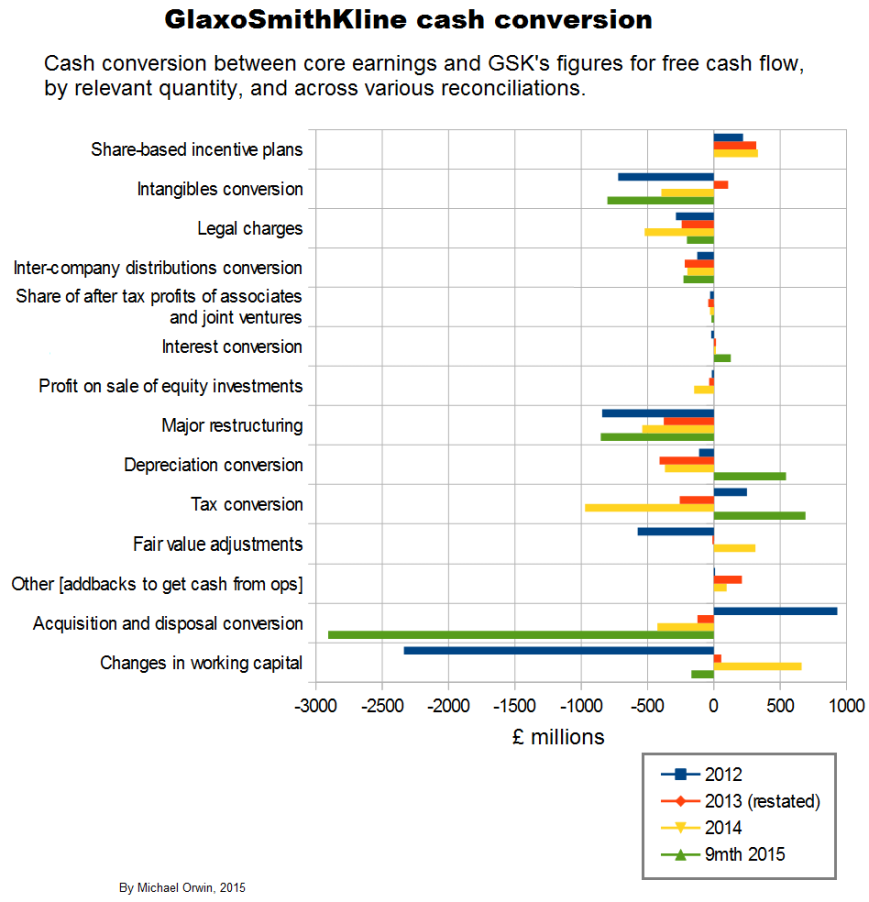
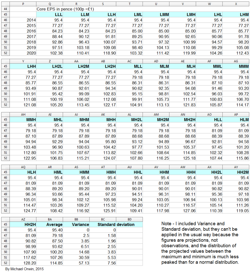
Core EPS and other per share quantities
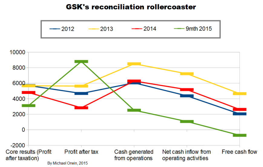
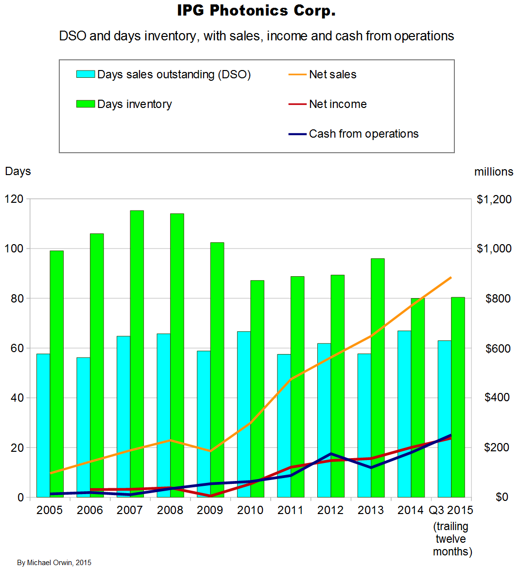
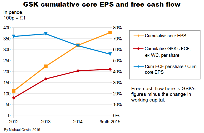
Core EPS needs to be examined because excluding costs doesn’t make them disappear. I’ve charted EPS and cash flow per share quantities in various ways, from 2012 (when GSK started giving core EPS) to 9 months 2015.
The period “9 months 2015” includes seven months since the transactions with Novartis, so that’s seven months without the oncology business, seven months with the Vaccines business acquired from Novartis, and seven months with the new consumer business which includes Novartis’s former consumer business, and where Novartis has a 36.5% minority shareholding.
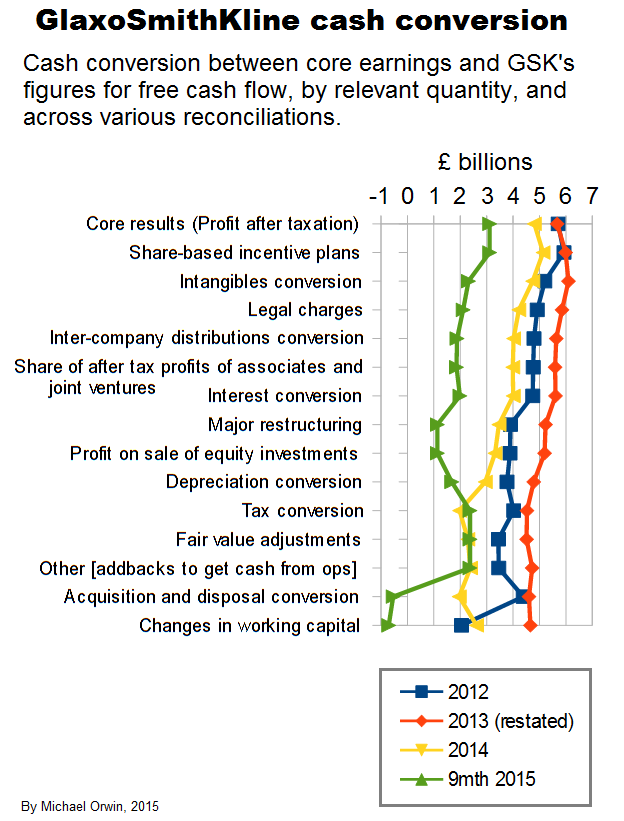
My “Cash from operations” (or “Cash from ops” or “CFO”) is always after deducting “Taxation paid”, which is different to GSK’s terminology (their “Cash generated from operations” is before the deduction). I also deduct net interest paid, and payments to minority shareholders net of dividends from associates.
I show two series of charts. The first three have CFO with the adjustments described above, and the investment flow is subtracted to get a kind of free cash flow. Subtracting the investment flow is not conventional, it includes acquisitions and disposals, and purchase and sale of equity investments. At least some of the equity investments are in companies where GSK have research collaborations, and that’s likely to account for all of the equity investments.
The investment flow includes “Decrease in liquid investments” which is not relevant, but it’s been miniscule except for £224 million in 2012 (4.15p per share). It also includes “Dividends from associates and joint ventures” and “Interest received” which results in some double counting in free cash flow, because those amounts are also in my adjusted OCF. Those dividends and interest received only sum to £286 million (5.9p per share), over 2012 to nine months 2015.
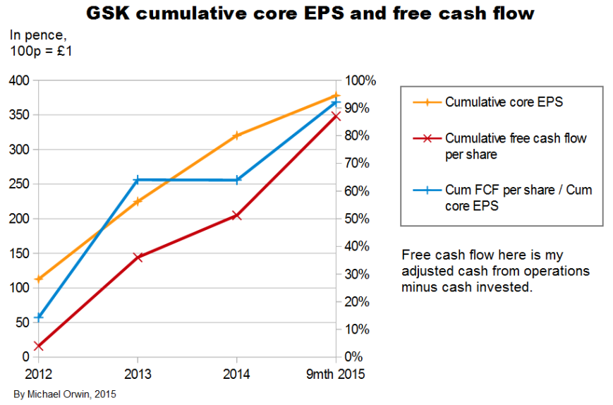
In the second set of three charts, CFO does not include changes in working capital. Free cash flow is calculated by starting with GSK’s own version and subtracting changes in working capital. From the annual report for 2014 –
“Free cash flow is the net cash inflow from operating activities less capital expenditure, interest and dividends paid to non-controlling interests plus proceeds from the sale of property, plant and equipment and dividends received from joint ventures and associated undertakings. It is used by management for planning and reporting purposes and in discussions with and presentations to investment analysts and rating agencies.”
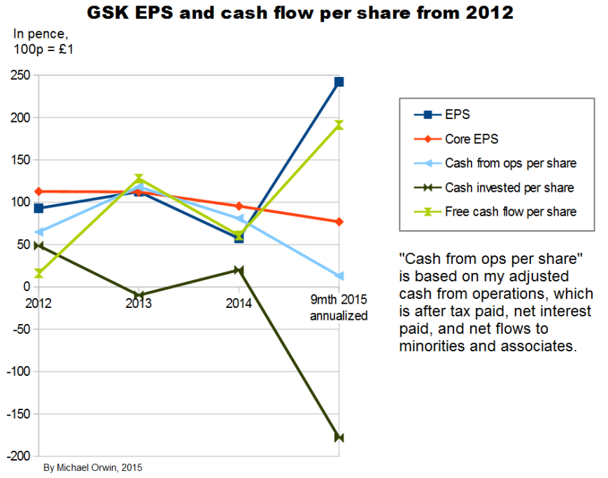
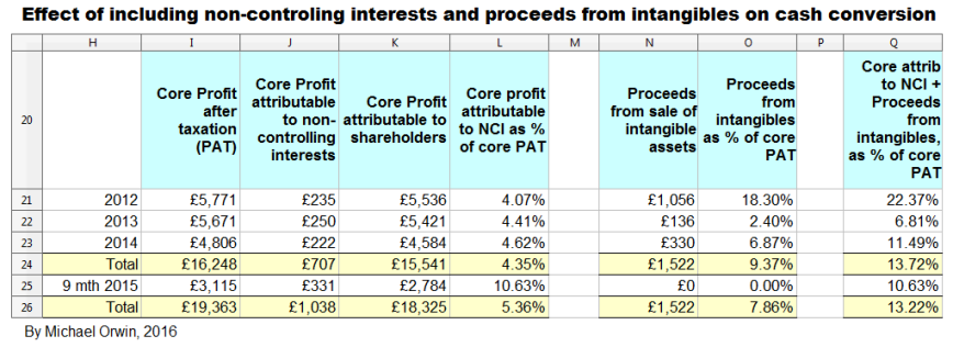
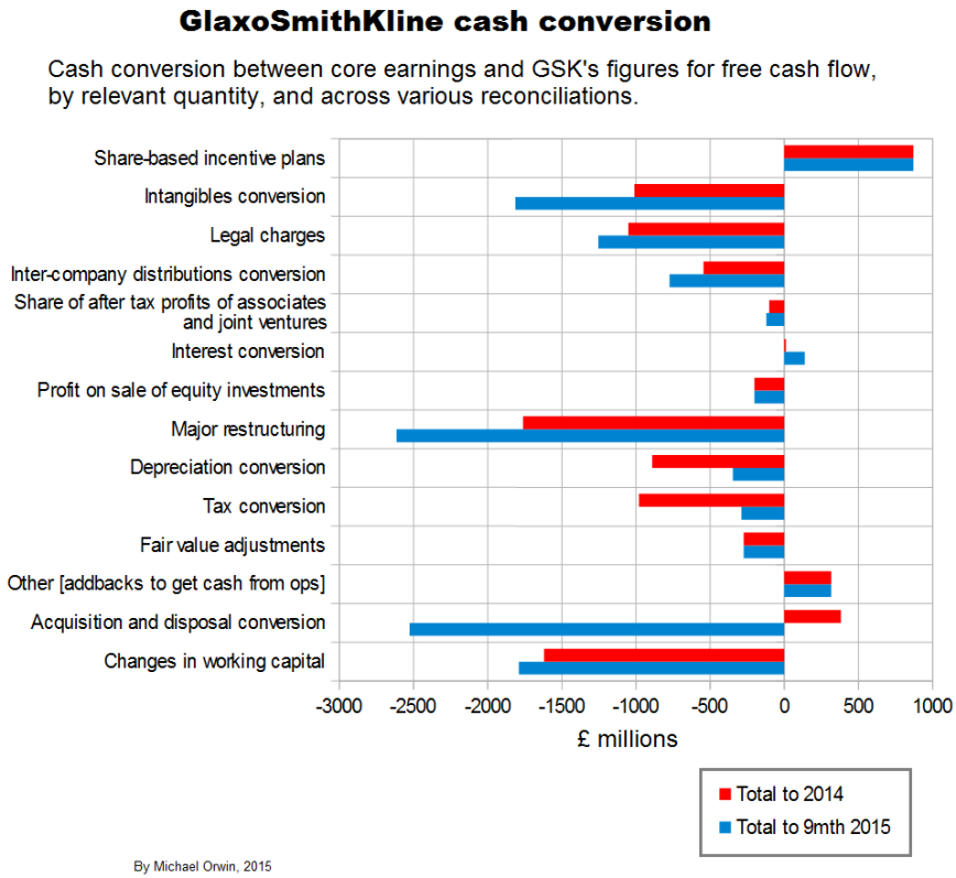
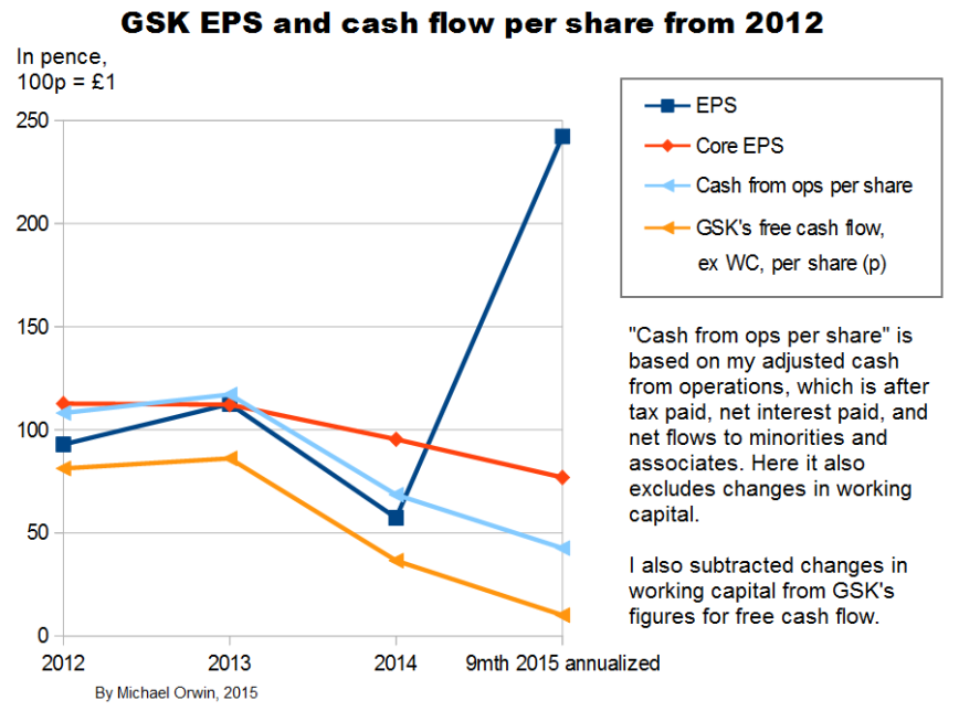
The chart above shows a great deal of variability in everything except core EPS. The annualization of the nine month period is only reasonable for core EPS, due to the effect of a big one-off investment inflow, with “Disposal of businesses” worth £10,253 million mostly from selling oncology – about the “Acquisition accounting” item, “This included the profit on disposal of the Oncology business to Novartis of £9,233 million” (or 172p per share, my calculation). The annualization consisted of multiplying by 4/3, and the movements would still be sharp without it.
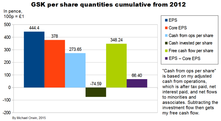
The “cumulative” chart above shows that core EPS has been less than reported EPS over the period, so it has not just been a way to ignore costs, although it would have been the other way round without the profit on selling Oncology, which is excluded from core EPS. Cash from operations was only 72% of core EPS, showing low cash conversion. There’s actually more free cash flow, due to the investment inflow in the 9 month 2015 period.
The ratio of free cash flow to core EPS over 2012 to 2014 is 64%. The period excludes the big investment inflow from selling oncology.
The variability in the figures and the change with the Novartis deal mean these ratios cannot be projected with confidence. There is scope for them to be higher through better cash conversion.
My original estimates of core EPS in 2020 were:
low ~ mid ~ high
103.32p ~ 116.25p ~ 130.49p
If cash from operations per share is 72% of core EPS (as averaged since 2012), then CFO per share in 2020 =
low ~ mid ~ high
74.39p ~ 83.70p ~ 93.95p
If free cash flow per share is 64% of core EPS in 2020 (as averaged 2012 to 2014), then FCF per share in 2020 =
low ~ mid ~ high
66.12p ~ 74.40p ~ 83.51p
Dividends have to be paid from free cash flow to be sustainable, and the low CFO estimate and the low and mid FCF estimates are less than the 80p dividend set for 2015, 2016 and 2017. It would take an improvement in the ratio of FCF to core EPS to get FCF per share of 80p in 2020, for the low and mid projected core EPS. In fact the ratio would need to be 68.82% (instead of the historic 64%) for the 2020 “mid” core EPS of 116.25p to convert to 80p FCF per share.
That seems achievable, as the problem is not that GSK have to make massive investments just to stand still, instead the problem has been low conversion of profit to cash from operations. However, “achievable” is not the same as certain. The ratio FCF to core EPS will be better if GSK can avoid non-core costs like big fines, restructuring charges and other “one-offs”, preferably for a long time, and the ratio won’t need to grow as much if core EPS exceeds expectations.
In the next three charts, the effect of changes in non-cash working capital is excluded. Following convention, in the context of cash flow I omit “non-cash”, although stricly speaking “working capital” is just current assets minus current liabilities, while non-cash working capital excludes cash and other liquid assets (like short term securities) used to park cash in rather than in the business operations, and it excludes loans. In the context of cash flow and owner’s earnings, “change in working capital” is like the decrease in it, not the increase, and a more logical term would be “the effect on cash of the change in (non-cash) working capital”.
The usual rationale for excluding changes in working capital is that big changes in it are not usually sustainable and the company has some control. If inventory fell from $100 million to $90 million, it couldn’t keep falling by $10 million for another ten years. For other cases such as an increase in receivables it’s not quite so clear that it’s unsustainable, for example sales growth could allow further increases even if Days Sales Outstanding stayed constant.
There’s more detail in “Changes in Working Capital and Owner Earnings – The Complete Guide” November 19, 2015 (oldschoolvalue.com). The guide isn’t quite complete. It’s right to concentrate on the working capital cycle, but it doesn’t say how the cycle can be affected by growth, seasonality or window-dressing synchronised to the reporting period, or how factors like a changing mix of products sold affects working capital, or how selling more through distributors or into Asian countries where payment takes longer can affect the cycle.
In the next three charts I use GSK’s own figures for free cash flow, and subtract the effect on cash of changes in working capital, from GSK’s FCF and from my adjusted cash from operations.
I’ll also mention here that Basic earnings per share were 82.6p, 95.5p and 94.4p in 2005, 2006 and 2007, so you can see there hasn’t been much growth in EPS since 2006.
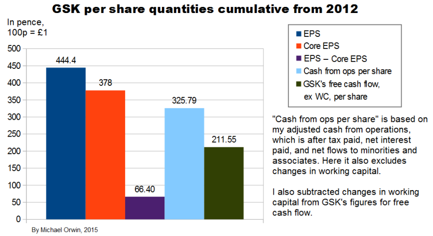
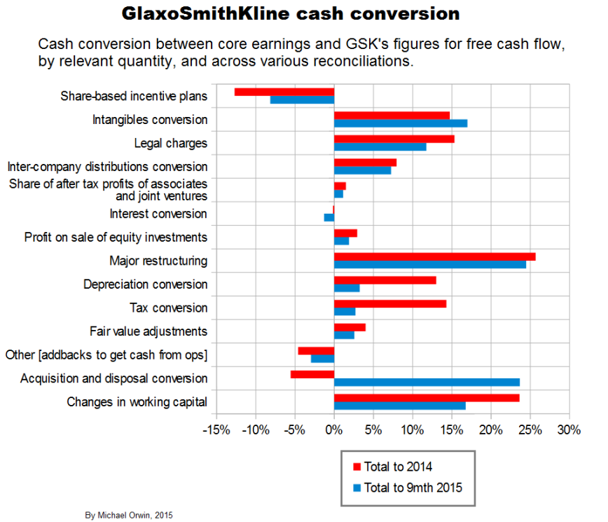
Excluding the effect of changes in working capital, the ratio of cash from operations (with my adjustments) per share to core EPS over the period 2012 to Q3 2015 is 86% (using the figures in the bar chart). Applying that ratio to my original estimates of core EPS in 2020:
low ~ mid ~ high
103.32p ~ 116.25p ~ 130.49p
I get CFO per share:
low ~ mid ~ high
88.86p ~ 99.98p ~ 112.22p
Subtracting the effect of changes in working capital from GSK’s own figures for free cash flow, the ratio of FCF per share to core EPS over the period 2012 to 2014 is 56%. Applying that ratio to my original estimates of core EPS in 2020, I get FCF per share:
low ~ mid ~ high
57.86p ~ 65.1p ~ 73.07p
Those figures are less than the 80p dividend planned for 2015 to 2017. Because FCF by GSK’s definition excludes acquisitions, it can’t be increased by not making them. The ratio would need to be 68.82% (instead of the historic 56%) for the 2020 “mid” core EPS of 116.25p to convert to 80p FCF per share. There are still reasons to believe the dividend can at least be maintained, which I’ve outsourced in a link under “The sustainability of the dividend”, below.
GSK have large current assets and current liabilities, and changes in them which are relatively small as a percentage of current assets or current liabilities can be big in absolute terms or compared to income. The decline of short term provisions had a big effect in 2012.
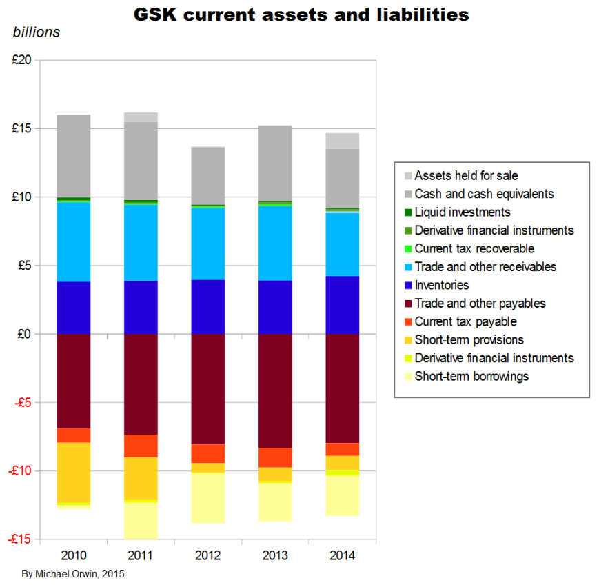
The items which figure in GSK’s cash flow statement under “Changes in working capital” are –
Current assets:
Trade receivables
Other receivables
Inventories
Current liabilities:
Trade payables
Other payables
Pension and other provisions
I reordered the list to match the chart above. The items correspond to the blue, brown, red and yellow areas. The other colors are for items which are too like cash or loans to be considered “working capital” (it would be more correct to call it “non-cash working capital”).
The next images show the spreadsheets that the charts in this section are based on. Everything is in £ millions exect per share amounts, dates, % etc. I found the reports by googling “GlaxoSmithKline annual report 2012” (etc., without the quotes). GSK don’t make it easy to find them, and the UK’s company information is way behind the US SEC’s EDGAR database of company filings.
The next spreadsheet image (and the formula view that follows it) is a version I used to check the original which the six cash flow and EPS charts are based on. The version for checking came out a lot neater than my first attempt, and the differences between both have been resolved.
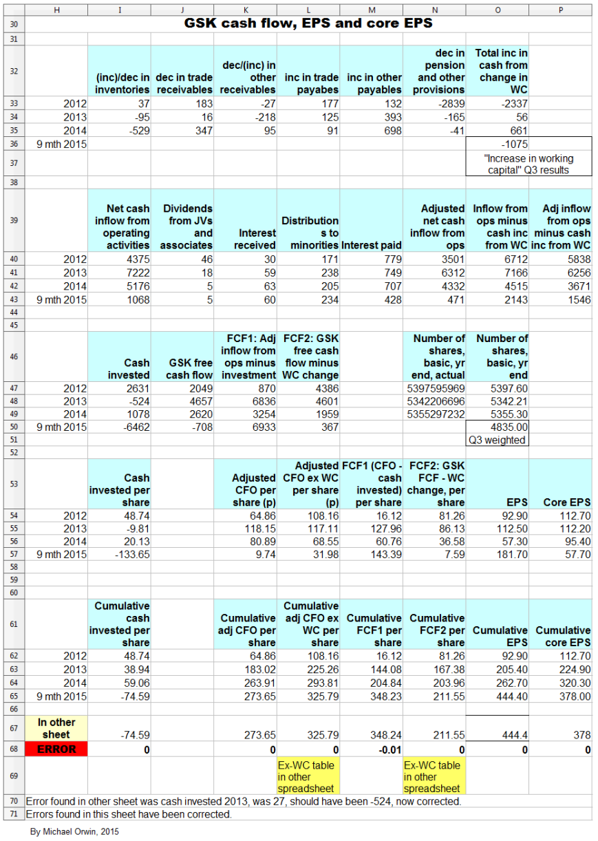
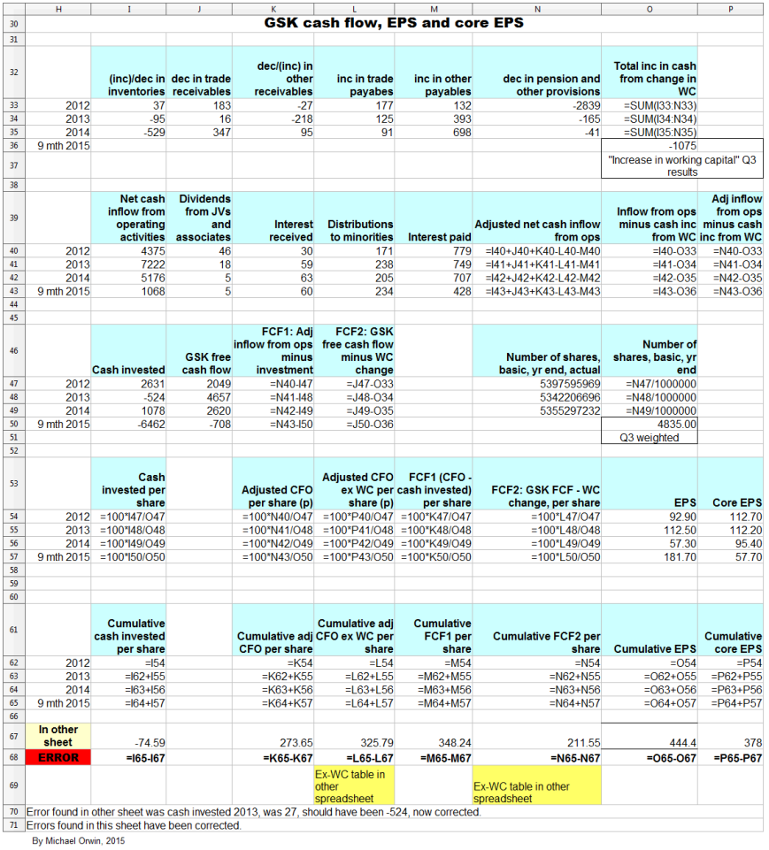
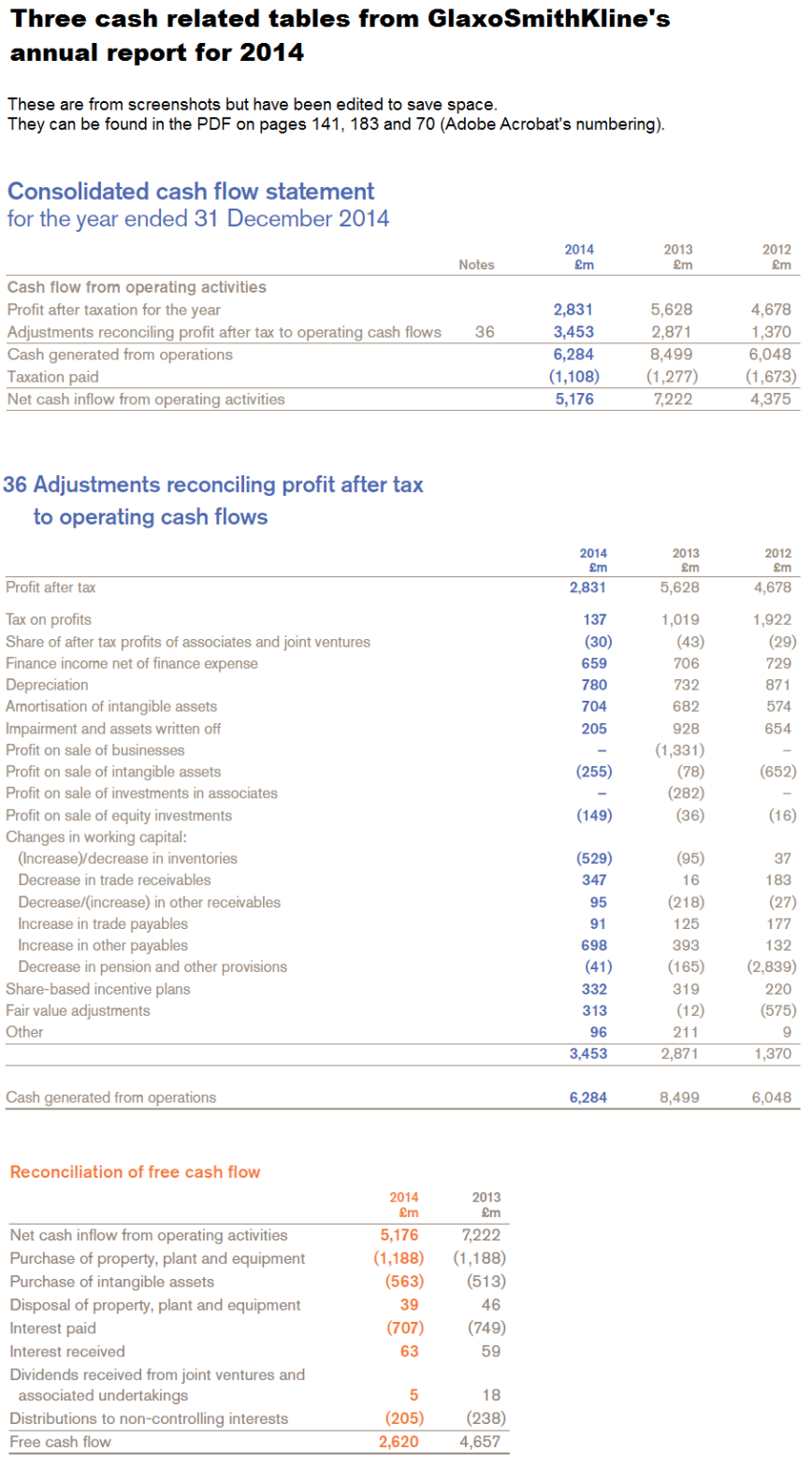
For convenience (if anyone wants to check the work), the next image has three cash-related screenshots from the annual report for 2014, one of which shows the movements in working capital. The screenshots don’t have all the data for 2012 to 9 months 2015, but the titles should help with finding the data in GSK’s documents.
Cash conversion and investment
The figures here are all in £ millions.
I said that higher cash conversion seems achievable, as the problem is not that GSK have to make massive investments just to stand still. I show that over 2012 to 2014, capex has only taken a small (5.20%) bite out of the core EPS, above the amount covered by including depreciation. I also show that capex and purchase of intangibles at historic levels relative to core EPS will not by themselves swallow up enough cash to stop free cash flow from covering the dividend. I have to admit that the reasoning towards those conclusions is hard to follow because of the number of steps taken.
I’ve calculated cash invested divided by my adjusted net cash inflow from operations (adjusted CFO), using figures shown in the spreadsheet (without subtracting the change in working capital) –
2012 ~ 75.15%
2013 ~ 8.30%
2014 ~ 24.88%
9mth 2015 ~ -1,371.97%
Using totals for 2012 to 2014, for cash invested / adjusted CFO –
3,185 / 14,145 = 22..52%
and including 9 months 2015:
-3,277 / 14,616 = -22.42%.
Apart from acquisitions, most of the investing flow is property, plant and equipment or PPE (followed by purchase of intangibles), at a fairly steady £1.1 to £1.2 billion a year. This quote from the annual report for 2014 suggests to me there’s some scope for PPE to come down.
“In 2014, we invested £1,261 million in new and renewal property, plant and equipment. This is mainly related to a large number of projects for the renewal, improvement and expansion of facilities at various worldwide sites. Property is mainly held freehold. New investment is financed from our liquid resources. At 31 December 2014, we had contractual commitments for future capital expenditure of £459 million and operating lease commitments of £701 million. We believe that our facilities are adequate for our current needs.”
However, the PPE needs to be kept to a high standard for productive research and for the quality of production, and it can’t be neglected. The freehold property could be used to support leaseback finance if necessary (if that would not break terms in existing debt agreements).
Adjusted CFO per share / core EPS was 82.39% over 2012 to 2014 (from 263.91p / 320.30p as in the spreadsheet), so in the period, cash invested / core EPS was 22..52% * 0.8239 = 18.56%. (I’d calculated cash invested / adjusted CFO = 22..52% a while back.)
Here some of the figures are from the annual report for 2014 and are not in my spreadsheet.
Net purchase of PPE totalled 3,274 in the period, making Net purchase of PPE / cash invested = 3,274 / 3,185 = 102.8% (the result is possible because of disposal of businesses in 2013).
Net purchase of PPE / adjusted CFO = 3,274 / 14,145 = 23.15%, and
Net purchase of PPE per share / core EPS = 23.15% times 82.39% = 19.07%. (I calculated adjusted CFO per share / core EPS to be 82.39% a few lines above.)
Depreciation and Amortisation of intangible assets amounted to 2,383 and 1,960 over 2012 to 2014, a total of 4,343, with depreciation equalling 72.79% of net purchase of PPE. Depreciation plus amortisation was 4,343 / 3185 = 136.36% of cash invested. Core EPS excludes most amortisation but not depreciation. Only 27.21% of net purchase of PPE was not covered by the depreciation included in core results. Multiplying that 27.21% by the 19.07% for “Net purchase of PPE per share / core EPS” gives 5.20% for the ratio “Net purchase of PPE per share not accounted for by depreciation in core EPS” divided by core EPS. In other words, capex has only taken a small (5.20%) bite out of the core EPS (above the amount covered by including depreciation in core EPS).
That still leaves the purchase of intangibles, which sums to 1,545 in the period, which are not amortised in core EPS, and which averaged 10.65p per share per year (at the Q3 share count of 4,835 (million)). The purchase of intangibles per share also averaged 9.98% of core EPS in the period (2012 to 2014). Per share, the excess of capex over depreciation, plus the purchase of intangibles, has averaged 5.20% + 9.98% = 15.18% of core EPS. Cutting the purchase of intangibles would risk missing opportunities for growth, or could leave awkward gaps in the company’s IP, although partnering to develop IP can be an alternative to buying it.
The lower core EPS I projected for 2020 was 102.38p, and 15.18% off that is 86.84p. That would be enough to pay an 80p dividend out of (but with not much cover), given the assumed core EPS and if free cash flow was not less than core EPS minus the two items: 1) capex in excess of depreciation, which is assumed to be 5.20% of core EPS, and 2) the purchase of intangibles, which is assumed to be 9.98% of core EPS. (It’s not usual to subtract capex from EPS, but I’m looking into the conversion of earnings to free cash flow, and the effect of capex and purchase of intangibles on that.) I don’t mean that those assumptions are likely to hold, just that capex and purchase of intangibles at historic levels relative to core EPS would not by themselves swallow up enough cash to stop free cash flow from covering the dividend. I’ll repeat that this is based on the low case assumptions for core EPS growth, and it’s the second and more pessimistic version where I assumed only 9% growth for 2016 based on GSK’s expectation – “percentage growth expected to reach double digits”.
Still some uncertainty about Q4
Here I’m quoting from GSK’s Q3 2015 transcript. About volatility in 2015 quarterly results –
“Q4 will be no exception, with the biggest quarter last year for Oncology sales dropping out, along with Avodart going generic in the US at the start of Q4 as well as the usual lumpy comparisons for vaccine sales, depending on the timing of tenders. We also expect continued growth in the minority interest, given the increasing contributions from HIV sales in the Consumer joint venture, and a much higher tax rate than in Q4 last year.”
Offsetting that there are new launch products and the benefit of cost restructuring programmes. Management are sticking to their 2015 guidance, which does not include the proposed divestment of remaining ofatumumab rights to Novartis, which could happen in Q4 or in 2016.
A question about Q4 EPS (and therefore full year 2015 EPS) was not answered with figures –
“The guidance for high-teens EPS decline this year, on a full-year basis, seems to imply that for Q4 you will have a really sharp decline, like at least 30% EPS decline. I would have thought that there would be further progress made on cost savings. Could you talk about the magnitude of the upward pressures in Q4 this year on opex, and why the guidance could not be a little better now? “
Reply:
“Q3 was pretty light for Consumer, but Q4 is going to be pretty heavy for Consumer because of the cough and cold season and the shifts around, and as you know, post the transaction we have a much bigger cough and cold portfolio than we had before the transaction, so you are going to see a few movements like that.
To a general point, we are very pleased with the performance in the quarter. Frankly, we still have quite a few moving parts for Q4 as the new businesses all settle down. Simon listed some of those in his commentary.
Let’s see how the fourth quarter plays out. We just felt actually it was a little early to declare victory. This is one step at a time. We are very focussed on delivering the best number we can and let’s see what Q4 looks like.”
Seasonal sales for flu and consumer caused an increase in receivables in Q3, which is expected to reverse in Q4. The expected reversal seems to contradict the light Q3 and heavy Q4 in the quote. Even if sales are early in Q4, I wouldn’t expect a rush to pay before year end.
The sustainability of the dividend
I’ve already looked into the ability to pay at least 80p in dividends per year in 2020, based on projected core EPS and the relation between core EPS and cash flow in the past (find “Core EPS and other per share quantities”, above). The results did not look good, but there’s scope for better cash conversion and for core EPS to exceed expectations. Presumably, management are confident of the ability to pay the 80p dividend they said will be paid for 2015, 2016 and 2017.
The current ratio (current assets/current liabilities) is 1.33 (as at Q3 2015) which is reasonable, but I mention below that the Altman Z score for bankruptcy risk is in the grey zone and not very far from the distress zone.
See “No, GlaxoSmithKline Is Not Going To Cut Its Dividend” by Ben Strubel, Nov. 3, 2015 (seekingalpha.com). While being mostly reassuring, the “however” at the end acknowledges the possibility of more risk at GSK than at pharma companies doing much better. My opinion is that a dividend cut would have a big effect on the share price and investors who can’t take such a loss of capital and income should avoid the stock.
There’s a piece on fool.co.uk where the author believes the dividend can be paid as planned – “How Safe Is GlaxoSmithKline plc’s 6% Dividend Yield?” by Rupert Hargreaves, July 6, 2015. The author mentions the plan to cut costs by £3 billion a year. The savings were in the Q1 results release, just before outlining the expected EPS growth, so the EPS growth should include the savings –
“Total annual benefits of £3 billion from combination of existing restructuring and synergy programmes, now expected to be largely delivered by end of 2017 within existing cost estimates but with an accelerated rate of expenditure”
GSK’s Q3 transcript has –
“Then, most obviously in our cost base where we are on track or slightly ahead of our plans and have delivered total incremental savings in the first nine months of this year of over £700 million compared to the same period last year, £300 million of that in the third quarter alone.”
The articles I linked to don’t consider the possible problem with the Novartis “put” option, where GSK might have to reserve more if growth in the value of the business is faster than expected. For more on that find – The Novartis “put” option – below. It’s a long section and I don’t write about growth until near the end.
GSK’s Beneish M-Score
According to gurufocus the M-Score signals that GSK are a manipulator (on gurufocus you have to click away a sign-in box before you see anything). The score is the highest (worst) in the last 20 quarters. I don’t have a lot of confidence in the M-Score, except that the breakdown gives a list of things to check. The Novartis transactions are the kind of thing that can affect the score quite innocently, but GSK’s score turned up in the latest quarter, as well as in the previous two. Part of the score is the Days Sales in Receivables Index (DSRI) and for GSK it implies a 16% rise over the previous year. In the Q3 results announcement GSK say –
“Working capital increased by £707 million in the quarter, primarily reflecting an increase in receivables in the quarter related to seasonal sales of vaccines and other products. This increased the working capital conversion cycle by one day. In the nine months, working capital was also significantly impacted by the inclusion of inventory acquired with the former Novartis Vaccines business. The increase was partly offset by favourable exchange effects.”
The Working capital conversion cycle is the same 216 days as at Sept 30, 2015 as it was on Sept 30, 2014, although it dipped in December and increased since then. However, “Working capital percentage of turnover” increased like this (the latest quarter on the right) –
24%, 22%, 24%, 25%, 27%
I suppose the latest increase was covered by GSK’s statement about Novartis Vaccines. Working capital affects the M-Score through an index called TATA.
It’s a quirk of the M-Score that companies are viewed with more suspicion if they reduce leverage (the opposite of what Beneish expected, and few people have noticed). GSK’s reduction of leverage gets them a low LVGI index, and multiplying by the coefficient of -0.327 gives 0.2392. Taking that off the M-Score gives -1.9392, which is still above the commonly used threshold of -2.22 (below which management are supposed to be honest).
My guess is that while management will want to give a positive impression, they’ll be reluctant to stray into earnings-manipulation territory. On the ethics front, GSK have good data transparency and make virtually no profit on vaccines sold to poor countries, but have been fined for bribery. A scandal over earnings-manipulation would confirm impressions that the company is corrupt, while the positive points would probably be ignored by the media. I expect management to be aware of that. I’ve never met the management and they might all be extremely honest people, but I feel I don’t serve readers by simply assuming a company’s management are more honest than the average for management.
Also on gurufocus, GSK’s Altman Z score (for bankruptcy risk) puts it in the grey zone, and closer to the distress zone than the safe zone. The current score is the lowest (worst) by far in the last 20 quarters.
For comparison, Pfizer’s M-Score suggests they are not a manipulator. Their Altman Z score is in the grey zone, but about in the middle, which beats GSK’s score.
Currency risk
The combination of head office costs in the UK and high international sales contributes to GSK’s exposure to the British currency. I haven’t found a breakdown of costs by region but I can quote figures under “Employees by region” in the 2014 annual report –
USA 17%
Europe 39%
Emerging Markets 38%
Japan 4%
Other 2%
The figures will have changed with the Novartis transactions, and –
“We also announced plans to change our geographical R&D footprint by bringing our significant R&D operations together into two global centres – one in Philadelphia in the USA and the other in the Stevenage area of the UK.”
See also a piece about planned job cuts under “Negative articles” below.
About the Novartis vaccines now acquired by GSK, the Annual report for 2014 has –
“The combined business will also benefit from increased exposure in key markets such as the USA where Novartis has a strong presence and track record of regulatory approvals.”
and the proportion of vaccine sales in the US increased to 44.5% in Q3 2015, although vaccine sales are lumpy so the figure is not a reliable guide to the future.
Derivatives are used to manage risk, but for currencies, “Foreign currency transaction exposures arising on internal and external trade flows are not generally hedged”, instead they match local currency income with local currency costs where possible. However, this looks like hedging –
“During 2014, the Group continued entering into forward foreign exchange contracts which it designated as cash flow hedges of its foreign exchange exposure arising on Euro and US dollar denominated coupon payments relating to the Group’s European and US medium term notes. This is a continuation of the initial hedging put in place in 2013.”
About borrowings:
“we seek to denominate borrowings in the currencies of our principal assets and cash flows. These are primarily denominated in US dollars, Euros and Sterling. Certain borrowings can be swapped into other
currencies as required.”
When GSK aim to preserve earnings that’s likely to be in the British currency, not the US dollar, but the “matching” principle mitigates the company’s currency exposure as much for a US investor as for a UK investor.
I’ve shortened a table that described GSK’s foreign exchange sensitivity. It’s now only a rough guide, after the Novartis deal –
Change in income, £m
2014 ~ 2013
10 cent appreciation of the US dollar
(263) ~ 40
10 cent appreciation of the Euro
11 ~ 8
10 yen appreciation of the Yen
– ~ 1
About not speculating –
“We do not hold or issue derivatives for speculative purposes. Our Treasury policies specifically prohibit such activity.” (2014 Annual report)
HIV success
“Dolutegravir-based regimens have done so well, because a) it is an excellent molecule and b) the team did the most phenomenal job of coming to market not just with one or two pivotal studies showing base competitiveness. It came to the marketplace with a full dataset comparing itself to most of the other regimens and demonstrated extraordinary performance. It is very rare that I have seen a product which essentially hit its mark in pretty much every trial it did in every class it was put up against. That is what has really made this product cut through into what is obviously a competitive market dominated by one company, and it is where we have been able to take very significant market shares very quickly and deliver, as I have said already, the most successful product launch in the category in the US.”
The “one company” is Gilead. Dolutegravir is in the ViiV joint venture, which some critics say should be spun out. For some confirmation, though without as much enthusiasm, see “GSK takes on Gilead with new two-drug HIV treatments” By Ben Hirschler, Sep 21, 2015 (uk.reuters.com).
While justifying the formation of the two joint ventures, the CEO acknowledged the effect of competition from Gilead. About forming ViiV –
“It was that move which gave the company and, frankly, the external stakeholders, the confidence that GSK was going to stay in the HIV market in the face of the onslaught from Gilead. That has allowed us to get through the desert, get to the other side, and now build something very, very exciting.” (Financial outlook and guidance, May 6, 2015, transcript)
With increasing longevity in patients with HIV, the focus is on reducing the toxicity of medications. Gilead’s “TAF” has completed Phase 3 studies (find “For more than a decade” to get past the technical stuff). The key benefit of TAF is a reduced adverse effect on bone density and kidneys. Gilead describe their progress in HIV in “Gilead Sciences’ (GILD) Presents at Piper Jaffray Healthcare Conference Transcript” Dec 1, 2015 (seekingalpha.com).
Glaxo’s chief strategy officer can see the day when there’s no more profit in HIV – “Success at Glaxo’s HIV Unit May Mean Having to Call It Quits” by Oliver Staley, July 9, 2015 (bloomberg.com). That’s great for HIV patients but not so good for Gilead and GSK, although the price per pill would be higher for a cure, and the research will be directed elsewhere when the potential for improvement becomes marginal.
The SUMMIT study and other negative results
GSK’s SUMMIT study was big, with 16,590 patients. It was meant to prove that Breo gave a survival advantage for severe COPD (chronic obstructive pulmonary disease), but results did not show that with statistical significance. Success had not been assumed or incorporated into forecasts, which indicates that the forecasts are conservative, with upside –
“I would just like to reiterate that SUMMIT was never in any of our forecasts that we shared with the street. So far, for example, when we said that we would deliver at least £6 billion of new product sales by 2020, that did not include SUMMIT – that was always an upside to those numbers.” (Q3 results transcript)
GSK said the failure had no adverse effect on Breo sales, and claimed useful results –
“Some of the outcome studies, as you say, have failed. Others, for example SUMMIT which missed its primary endpoint, contained within it an awful lot of incredibly useful information which the scientific community are picking up on: reduction in exacerbations, the ability to show that the safety signals are rather reassuring and in fact the decrease in the decline of lung function in patients on the treatment there.” (R&D event transcript)
There’s a less rosy view in “Glaxo Shoots Itself In The Foot… Again” by EP Vantage, Sep. 9, 2015 (seekingalpha.com), where it’s implied that with no survival advantage over either of Breo’s two components, prospects were poor for Breo, and also for turning around GSK’s respiratory division.
About failed outcome studies –
“I don’t think the failures we have had are molecule quality failures. There is no doubt where we have had failures, there are issues around targets and that is why there is such a big investment we have put in target sciences.” (R&D event transcript)
Either the failed drugs didn’t latch on to the targets or poor targets were selected. It doesn’t sound great but this is science – if you knew the result for sure you wouldn’t need to run the experiment. GSK say –
“We absolutely have introduced new designs which include interim analyses, utility analyses and ability to get early read-outs, and I gave you an example for a smaller study here in respiratory with a real in-stream data analysis. We think we’ve got actually a rather sophisticated way of looking at outcome studies.” (R&D event transcript)
GSK has two failures in “Top 10 Clinical Trial Failures of 2014” Feb 9, 2015 (genengnews.com). So do Merck. Only drugs that did not meet their primary endpoints were considered. More recently there’s “GlaxoSmithKline’s cardio R&D group records another big PhIII flop” by John Carroll, October 27, 2015 (fiercebiotech.com). The author is critical of the company’s cardio group, implying they push projects along the pipeline that ought to be killed.
Previously – (the link has irrelevant video that starts automaticaly) “Glaxo’s Utter Stinkbomb Of A Drug” by Matthew Herper, Forbes Staff, Mar 31, 2014 (forbes.com). Cardio drug darapladib failed, and made some patients smell. The author criticizes GSK for developing a drug that no-one would take even if it worked. Adding the percentages, at worst 9% of patients on the drug had a diarrhea or odor problem compared to 1.1% on the placebo. 9% is high, but if it didn’t take too long for the effect to wear off, IMO a patient could reasonably take the drug, stop if there was a problem, and stay indoors for a while. Drugs have had worse side effects. However, pursuing development was probably a mistake, though it’s easy to say that with hindsight.
Cardiology is not one of the six areas GSK say they are focused on, and there isn’t much about it in the R&D event presentation or transcript, with only one cardio drug in the selection from the pipeline (GSK2998728 TTR production inhibitor TTR Cardiomyopathy, subject to exercise of option). Cardiovascular, metabolic and urology had revenue of £965 million in 2014, 5.2% of the drug and vaccine sales (of £18,670), not counting any cardio drugs in Established products (£3,011 million). Most of the £965 million had nothing to do with cardio, as it included Avodart revenue of £805 million and Avodart is used to treat benign prostatic hyperplasia (BPH).
Recent failures and return on investment
From the R&D event transcript –
Q – “Then, finally, a question on the return on investment and, obviously, you showed us what you believe your return on investment to be, a couple of years ago. In that time darapladib and losmapimod have fallen over and Breo and Anoro are doing, perhaps, less well than we all expected, so would you expect that return on investment to fall dramatically when you restate it next year?”
A – “we will be publishing the IRR next year, as we said we would, and, no, I don’t, and I think if you look at the value that is created from the Oncology pipeline you will see that there have been some very startling successes as well, in terms of the income.”
Darapladib and losmapimod are both heart drugs, see the previous section “The SUMMIT study and other negative results” for criticism of GSK’s cardio division.
IRR is Internal rate of return. It was announced in February 2014 that the IRR on R&D was estimated to be 13%. A long term target of 14% was announced in 2010 when IRR was 10%. Those IRR figures are about ten times higher than the return on R&D given for GSK in an industry ranking in May 2014, find “22 Companies Ranked”, below. IRR is non-GAAP so regulators don’t take much interest in the figures.
Upside in the pipeline
1) The pipeline looks good, if this from the R&D event presentation is reliable –
“Of the ~40 assets profiled today, 80% of new molecules, biologicals and vaccines are potentially 1st in class”.
The figure will be lower for assets not selected for the event. Obviously, there’s a difference between “1st in class” and “potentially 1st in class”. You can’t expect “definitely 1st in class”, but they could have added something like “we believe at least 60% will be first in class” if they had enough confidence. (BTW a cynic might believe the R&D day was prompted by criticism and calls for the company to be broken up.)
2) There’s a good record of approvals from the FDA. After talking about reducing fixed R&D costs, the CEO said –
“That is why, over the last five years, nobody else has developed or filed or gained registration approval by FDA for more products than GSK, so we have been able to deliver a very substantial amount of product, while we have been able to control our R&D cost, because we have been taking out fixed cost and dedicating the resources to flexibility project cost. We will continue to do that.” (GSK’s R&D day transcript)
Later in the PDF –
“Quality: Andrew has already alluded to the fact we have had more approvals than any other company. The number isn’t what matters, the fact is that actually we have more first-cycle approvals and we have had nothing but first-cycle approvals since 2012. That is a marker of quality; you don’t get that just by doing things fast, although you will see we actually do, do things fast in terms of development organisation.”
The performance could be less good over different periods. I won’t critize the remarks for selection bias, because R&D was reorganized around 2008 to 2011, so the periods seem fairly reasonable. Ideally the “quantity” and “quality” periods would have been the same, but “nothing but first-cycle approvals” is a tough metric because it would be ruined by a single exception. About competition to the pipeline –
“we think we have an extremely competitive profile not just against the current standard of care out there on the marketplace, but also, much more importantly, we think it is pretty future-proofed about anything from anything that is coming down the pipe.” (the Q3 results transcript)
The last statement is an opinion and its usefulness depends on how far you trust the management.
3) Some of the pipeline is large molecule or biological, which might be harder for generic manufacturers to copy, but I can’t be more specific than “some” and “might”.
4) Nucala has been approved by the FDA, after the R&D day. It’s for severe asthma, in combination with other drugs. The approval was more broad than expected, according to “GlaxoSmithKline plc (ADR): Why Nucala’s FDA Approval Is Significant“. Also, “GSK receives European marketing authorisation for Nucala® (mepolizumab) in 31 countries” December 2, 2015 (gsk.com).
5) Upside from the pharma pipeline is underlined by the projected growth in pharma trailing vaccines and consumer. From the Q1 2015 results release –
“Group revenue expected to grow at a CAGR of low-to-mid single digits over the five year period 2016-2020 on CER basis:
– Vaccines sales expected to grow at a CAGR of mid-to-high single digits
– Pharmaceuticals sales expected to grow at a CAGR of low single digits with the possible introduction of generic Advair in the US factored into this assessment
– Consumer Healthcare sales expected to grow at a CAGR of mid single digits”
The low growth of pharma could combine optimistic assumptions about the pipeline, with the decline of off-patent drugs, but that’s limited by some impact already for Advair and Lovaza, and the statement about Advair – “I do not believe for a second that that erosion will go to zero” (Q3 results transcript).
Hepatitis C
The R&D event transcript has this about Hepatitis C and HCV (the Hepatitis C virus) –
“HCV, of course – there are cures, and here I will just focus on one thing when I get to it, which is the way of thinking about the single administration cure for HCV.”
The problem here is that Gilead (GILD) already have good cures. Even if the single dose is attainable, that’s not likely to be enough to compensate for getting late to the party, when Gilead have cured many cases, leaving fewer for GSK and probably establishing a record of safety and efficacy. I can’t say that GSK should definitely have dropped their HCV NS5B inhibitor. I don’t want to be a “back seat driver” when I don’t have all the information or expertise. Maybe most of the cost is sunk and it’s worth spending a little more even if the payoff is not all that big (they can’t tell shareholders that the HCV product won’t be good enough for high sales without jeopardizing sales or negotiations). Other companies including Gilead and Merck are still developing HCV products, and while that represents competition it also suggests it isn’t entirely “game over”.
Searching the transcript for “cure”, I found no other cases of pre-existing cures. Because the cures for HCV were acknowledged, for the assets profiled at the R&D day it’s fairly likely that other cures would have been acknowledged if GSK was competing with them, at least if they were as good as Gilead’s HCV cures.
Asthma in Africa
This is relevant to Nucala which was approved recently. Nucala is for severe asthma, in combination with other drugs. I don’t like saying that disease in Africa is positive for GSK, but if any investors believe that asthma is only a “rich world” disease they need to read this – “South Africa has world’s fourth highest asthma death rate” Sept 11, 2012 (health24.com). Pharma products are typically sold at much lower prices in poor countries.
Negative articles
I dispute some of the negativity, under “Reasons to like the small team structure”, below.
This is old – “3 Things to Loathe About GlaxoSmithKline” by G A Chester, June 21, 2013 (fool.com). The ten year total return was under 6% and lagged most European pharma companies. With the share price now lower than when the article was published, the picture is not likely to have changed.
The next link covers corruption, an issue I haven’t seen mentioned recently – “GlaxoSmithKline: The Bad Isn’t All That Bad” by stockpucker, Aug. 20, 2014 (seekingalpha.com).
“UPDATED: GlaxoSmithKline rips into RTP R&D group, chopping 900-plus jobs in global reorganization” by John Carroll, December 3, 2014 (fiercebiotech.com). The piece gives space to GSK’s claims about sharpening focus etc., before blaming poor performance on the reorganization of R&D into small teams. While 2013 was a good year for the number of FDA approvals, they were for drugs with low commercial potential. It’s implied that researchers were expected to behave like entrepreneurs, an unreasonable expectation for most scientists. IMO someone has to be able to assess both the science and the commercial prospects, for the efficient allocation of funds, without which income won’t grow, and ultimately that would also be bad for the R&D spend and drug discovery.
Being too keen to punish failure can reduce collaboration (as in Microsoft’s organizational chart). Some scientists are entrepreneurial and are likely to prefer the small team structure. The article “GSK’s Biotechy World” by Derek Lowe, July 1, 2010 (blogs.sciencemag.org) describes the problem – the huge pharma companies that resulted from consolidation had R&D strangled by bureaucracy, with low return on the cost.
There’s nothing new about GSK wanting to be nimble like biotech – that was the motivation claimed for splitting R&D into six units in 2001. See “GlaxoSmithKline pushes its labs towards ‘biotech’ future” – you are likely to see something about “access” and only see one paragraph, but it’s enough to confirm the story. The logic seems to be that if splitting into six didn’t achieve the objective, splitting into smaller units (and initially, adding job insecurity) would do the job. While the previous failure is not reassuring, bureaucracy is a big problem for big companies, and at least GSK have been trying to do something about it.
The author of “Acronym-Fest: GSK and Its DPUs” by Derek Lowe, December 2, 2011 (blogs.sciencemag.org) has deja-vu about claims for the new model such as being nimble. It’s a short article with many comments, some from ex-Glaxo/Wellcome scientists who say research went downhill after merging with SmithKline Beecham in 2000. Other comments are about the failure of similar models in other companies. Researchers from various companies bemoan the many visions they had to try to adapt to, such as labs should be like factories.
Back in May 2014, GSK were in the bottom quarter in “Who’s The Best In Drug Research? 22 Companies Ranked” by Matthew Herper, Forbes Staff, May 22, 2014 (forbes.com). The score used is a rather odd combination of economic return and other metrics like patents per million dollars of R&D, with the top company having a low economic return (but higher than GSK’s). Approvals from the FDA are not included, the reason given is they are too random. The charts showing a long term decline in return on R&D might put you off investing in the industry.
The R&D teams
The R&D teams are called “Discovery Performance Units” (DPUs). They are interdisciplinary, it’s claimed they are given sufficient time to produce results, and they seem to be left to get on with their work without too much interference, although there are annual reviews of R&D which in theory should weed out any projects that have become non-viable. From the R&D event transcript, after being asked why peers didn’t use the DPU model –
“DPU model: well actually the DPU model is really pretty straightforward. It is about saying “Have you got leaders in the organisation that you trust to try and get on and make medicines in interdisciplinary groups?” I think if you look at what many companies have done they have pretty much gone down that sort of road one way or another; not fully, not always calling it a “DPU model”. I don’t think it is as unusual now as it was when we first introduced it and it is based on a pretty simple idea, which is you need the disciplines inter-related. They need to be able to talk to each other on a daily basis, you need a leader who can lead that. It is rather like the biotech model in that respect and you need to give people time to pursue their areas. Perhaps the best example that you are going to see today is the unit that John Bertin leads, which has been absolutely relentlessly focussed on innate immunity and pattern recognition receptors for the last six or seven years and has become world-leading.”
For more on the annual review of R&D, find “prioritisation and stopping things” in the next section.
This is a balanced piece about GSK’s DPUs, even though the title is a bit dramatic – “Glaxo Scientists ‘Live or Die’ With Project in Research Overhaul” by Albertina Torsoli, November 30, 2011 (bloomberg.com).
It seems difficult to devise a structure or system that gets the right balance between science and profit, bearing in mind that a relentless focus on profit could kill the science without which there’d be no profit. Teams should probably be rewarded for finding problems like toxicity early, but that could be hard to implement in practice. There’s a risk of teams becoming uncooperative silos, and a risk that teams will be rewarded for their ability to “sell” their work to reviewers. A lot depends on the project reviews being fair, with competence in both business and science needed. One problem with the small biotechs GSK are trying to imitate is that by over promising they can keep good salaries for staff and management going for years.
If the R&D structure proves to be fundamentally flawed as implied in some of the negative articles, one possibility is a further reorganization, which could either work or make things worse. If the pipeline underperformed by enough to threaten the dividend, the stock would fall, but with some chance of GSK being acquired. I see those possibilities as relevant to considering the long term downside, but I can’t put probabilities to them.
The R&D budget and job cuts
Asked about the possibility of cutting R&D after losing the oncology business and gaining OTC (consumer) and vaccines, the president of pharmaceuticals R&D said no, because jobs had already been cut while restructuring R&D. From the R&D event transcript –
“In terms of the R&D budget, clearly, as Andrew has said, we have actually undergone some quite substantial reduction in headcount, we have done restructuring to end up with the right sites, with the right footprint, and that has freed up money to put into projects and I think that we have got a budget which allows us to deliver what we have described here, we have got a budget which allows us to drive these things forward fast. I will remind you that we took BRAF from powder on the bench to approval in under five years, we took dolutegravir from powder on the bench to approval in six years, we have done the same with actually Anoro for inhaled. So I think we have got a budget which is designed to allow us to deliver what we have got there, I don’t think we are in the stage where we are going to need an uplift unless all of this turns out to work that I am going to talk about today and I don’t expect that all of it is going to work and I don’t see opportunities for reducing that. I think that would be a way of actually diminishing the chance of getting the returns that we’ve got from these medicines.
And the final point to say is we every year, and this year particularly knowing the excitement that we’ve got in the pipeline, really go through a process of prioritisation and stopping things and one of the key things in R&D is knowing what to stop and making sure that you don’t spend money where you don’t need to.”
Keyur Parekh from Goldman Sachs made the point –
“Glaxo has more R&D sites than Roche for a budget that is 50% lower than Roche.”
In reply Patrick Vallance, the President of Pharmaceuticals R&D, said that the rationalization to two major global sites was addressing that. As well as recent closures,
“We also closed a major site in the UK about seven years ago”
In answer to –
“your spend on facilities and central support functions is now about 15% of total R&D, up from 11% in 2012.”
the R&D spend varied with opportunities and especially with the number of Phase 3 studies. I’m not sure about that reply, at least not if the 15% “now” included the non-central cost of the failed SUMMIT study, with 16,590 patients. While a higher proportion of spending on facilities and central support is contrary to GSK’s aim of reducing fixed costs, scientists need good labs to be productive.
It seems to be assumed that fewer, bigger sites are better for R&D. In academia a UK study concluded the most productive lab size was 10 to 15 members – “Lab Size Study Stirs Debate” by Bob Grant, February 9, 2015 (the-scientist.com). About Pfizer’s huge lab in Connecticut – “Mergers don’t make good medicines” by Scott Gottlieb, May 9, 2014 (independent.co.uk). The article claims the failed megalab is now mostly mothballed.
I have a theory (which I don’t wholly believe). Change such as a reorganization or a merger disrupts research. Early stage work becomes subject to review, and scientists who just want to get on with discovery are frustrated and some of them leave. The disruption leads to less discovery for a long time. Before there’s enough time for scientists to settle back into productive research, the lack of commercial success prompts more disruption, in the form of mergers, consolidation of research sites, or reorganization, and the cycle repeats. The first half of that is more or less from the ‘Mergers don’t make good medicines’ article, and the second half depends on management being reactive rather than doing nothing, which seems fairly likely. I don’t mean that hopeless projects should continue, but productive teams should be left to get on with their work with the minimum of disruption.
Reasons to like the small team structure
Against the claim of poor performance from GSK’s drug R&D, there have since been good results for HIV, in the ViiV joint venture. The previous quote “the team did the most phenomenal job of coming to market” suggests GSK’s usual team structure applied to the joint venture, and about ViiV and consumer healthcare –
“In the case of both of these JVs, we made it super-clear that GSK is operationally in control of everything to do with these businesses on a day-to-day basis.” (Financial outlook and guidance, May 6, 2015, transcript)
and I conclude that ViiV’s success is evidence that the team structure is at least compatible with success.
The reviews on glassdoor.co.uk (later) are fairly good, suggesting that GSK’s scientists are not demoralized by the reorganization.
See also “Recent failures and return on investment” (above), where oncology is cited as a successful area, and there’s enough success to compensate for the failures to ensure that the return on R&D will not have to be revised down.
Allegations about the drugs industry
There have been a few books on this theme. On Amazon, with reviews:
“The Truth About the Drug Companies: How They Deceive Us and What to Do About It” by Marcia Angell, August 9, 2005. An anonymous reader who claims to be a Vice President in one of the biggest drug companies, gives the book a five star rating.
“Bad Pharma: How Drug Companies Mislead Doctors and Harm Patients” by Ben Goldacre, February 5, 2013
Possibly too UK-centric for US readers.
“Big Pharma: Exposing the Global Healthcare Agenda Paperback” by Jacky Law, February 6, 2006
A common theme is the way companies spent a lot on lobbyists and funnelled money to doctors and journals to promote drugs. It’s alleged that more was spent on marketing than on R&D, and the marketing cost was included in the high cost of developing a successful drug.
An honest model
GSK stopped paying doctors to speak for them, and stopped paying sales reps for hitting sales targets. From GSK’s transcript for the Investor Event, May 6, 2015 –
“The changes we have made in our healthcare practitioner payment model, where we are the first company to walk away from paying doctors to speak on our behalf, where we have already stopped paying any representative anywhere in the world bonuses associated with short-term sales, are all designed to establish a commercialisation model which is in step with the external stakeholders of this industry: the payors, the governments, the regulators. Make no mistake, the business model which has historically been prosecuted by this industry, the commercialisation model, is not in step with regulator, government or payor expectations. We made the call two years ago to start that journey, and we reiterate today that we see this not just as something we have to; it is something we want to do. It is something that we know is difficult, we know is challenging, but we believe that it is potentially an extraordinary defining competitive advantage if we are able to succeed. The early progress we are making is very reassuring and convinces us that we are on the right track.”
I can’t help liking that, but there could be some risk as well as reward in being the first mover, rather than waiting to see how it works out for a peer. About not paying sales people for hitting sales targets –
“We altered the way we reward our customer-facing pharmaceutical and vaccine sales professionals in 2011.
This new system rewards sales professionals for the quality of their interactions with healthcare professionals, including an element of customer evaluation, rather than for achieving individual sales targets.
This approach aligns with our core value of putting the interests of patients first and the goal we share with healthcare providers of improving patient health.” (Annual report for 2011)
One abuse I’ve heard of is the funding of patient advocacy groups who demand that the patron company’s drugs are supplied by the healthcare system. It’s natural for patients to want the best drugs, regardless of the expense to the state or insurers, so patients are natural allies of pharma companies with the best drugs. I expect some patient groups do a lot of good work, whether or not they are demanding wider prescribing for some drugs. I’ve found nothing about GSK funding patient groups. This alleges a different abuse of patient groups – “Big pharma mobilising patients in battle over drugs trials data” by Ian Sample, July 2013 (theguardian.com).
Woodford, break-up, Berkshire and insiders
Neil Woodford is a highly regarded UK fund manager who has invested fairly heavily in GSK, see “Neil Woodford: GlaxoSmithKline’s troubles are only temporary” by Denise Roland, August 5, 2014 (telegraph.co.uk). Since then he’s called for the company to be broken up – “City Star Woodford Urges £67bn Glaxo Break-Up” October 24, 2015 (news.sky.com). If a trader called for GSK to be broken up, it would not be surprising, but Woodford’s record suggests he would be patient so long as he remained confident about long term success. He might genuinely believe that GSK’s parts would perform better as independent businesses, or he might now have doubts about GSK’s long term success and see a break up as providing a full or partial exit. Woodford still liked GSK after meeting the management, which is a point in favor of being able to trust management, as Woodford would not have got where he is if he was easily fooled.
In – “Is Neil Woodford Right About GlaxoSmithKline plc & HSBC Holdings plc?” by Dave Sullivan – Tuesday, 1 December, 2015 (fool.co.uk) – skip to “Breaking up, or spinning off?” – one point made is that Woodford believes the CEO is managing too many business, so “consumer” should be spun off. I don’t believe having multiple businesses is necessarily a problem, if competent managers with integrity can be found. Warren Buffett famously headed many disparate businesses where control was decentralized to trusted managers, and Berkshire Hathaway head office only had 24 employees according to “Here Are All Of The People Warren Buffett Works With At Berkshire Hathaway’s HQ” by Sam Ro, March 1, 2014 (businessinsider.com). GSK only need a trustworthy manager at Consumer to avoid the JV being much of a distraction to the CEO.
If it’s true that Woodford said GSK has much unlocked value, it would be hard for him to unload without harming his reputation, unless news makes a change of mind credible.
The fact that with the Novartis deal, GSK reduced its exposure to prescription drugs, implies low confidence in the prospects for them, or that prospects might be good but are uncertain due to pressure on pricing, particularly from buyers in the US. If the prospects are uncertain, GSK did the right thing, and if GSK got it wrong, they should at least benefit from the drugs they retained.
Berkshire Hathaway sold all their GSK stock in the fourth quarter of 2013. It’s reported on insidermonkey.com (the page might jump a lot while loading).
This broker’s page is the only convenient source I found for “Director deals” (the UK version of insider transactions). A large sale and purchase almost cancel out. Those are by Abbas Hussain, President of Global Pharmaceuticals. The purchase shows he owns over £1.9 million worth (about $2.9 million USD). Patrick Vallance, the President of Pharmaceuticals R&D, also bought in September, though in a much smaller quantity, see the link for more detail. There could easily be a lot more insider ownership that I did not find.
The consumer business
The main brands are –
Pain relief – Voltaren, Panadol, Excedrin, Fenbid
Respiratory – Theraflu, Otrivin, Flonase, Contac, Smokers’ Health
Oral Health – Sensodyne, Polident, Parodontx, Biotene, Aquafresh
Nutrition/Gastro intestinal – Horlicks, Eno, Tums
Skin Health – Physiogel, Abreva, Zovirax, Lamisil, Fenistil
From “GSK announces major 3-part transaction with Novartis …” April 24, 2014 (us.gsk.com) –
“Following completion of the transaction, GSK will be a global leader in Consumer Healthcare with revenues of £6.5 billion, on a 2013 pro forma basis. The new business will hold category leading positions and brands in Wellness, Oral health, Nutrition and Skin health, combining OTC and FMCG capabilities and expertise.”
(OTC – Over The Counter medicines. FMCG – Fast Moving Consumer Goods)
“In Wellness, the new combination’s £3.4 billion complementary portfolio will create the world’s largest OTC business with the leading position in more than 35 countries around the world.”
I’ll repeat that the consumer healthcare business combines GSK’s strength in emerging markets with Novartis’s strength in Central and Eastern Europe and CIS. The Q3 2015 pre-announcement aide memoire gives Consumer revenue of £6.1 billion, 12 month pro forma 2014 (£bn at actual rates).
Having both prescription and consumer products means GSK can sometimes switch a product from prescription to consumer (“Rx/Cx switch opportunities”, in the jargon) –
“This is a proven capability for GSK, it is one that we are investing in and we expect and plan to target a switch every five years” (Financial outlook and guidance, May 6, 2015, transcript)
I’m not certain that when a prescription product is switched into OTC, ownership is transferred to the joint venture. If that’s the case, there would need to be compensation from Novartis or they’d be getting a free ride via their minority interest. Because GSK manage the “day to day” business of the joint venture, there’s no need for the set of products managed by the same team to be the same as the set of products owned by the joint venture. It’s likely that Novartis could also switch prescription products to OTC.
“A wonderful example of this and the incrementality it can bring for us and our retailers is Flonase. Flonase was a bestselling prescription drug in North America, a clinically proven superior product that treats not just one allergic response but six. We could not have switched this product without our Pharma colleagues, because we were tapping into 40 clinical studies and submitted 600,000 pages of data to the FDA. We launched it with a military FMCG style approach, 23 miles of shelf space and nearly a million assets at point of sale, and I am really pleased to say that we were able to achieve, just in a couple of months, over 11% market share. We are the top one and two SKUs in Health and Beauty across the US at the moment. We are 0.3% off being the number one ‘recommended by doctor’ allergy product and, most excitingly for us and the retailers, 70% or our source of volume is from people who are new to the OTC category.” (Financial outlook and guidance, May 6, 2015, transcript)
Starting with an 11% operating margin, GSK aim for at least 20% by 2020, which would put them in the top quartile of FMCG and OTC players. From the same transcript, about savings in two areas –
“In non-working Media simply by adopting best practices around origination and global asset management I think we will get between 15% and 30% savings on production. In Market Research, simply taking out the duplication in similar categories, modernising and digitising and focusing everything behind those Power Priority Brands will also release savings.”
To explain the jargon, a TV ad is “working” because it reaches the target audience, while measuring the effect of it is “non-working” (see “Non-working marketing spend – A story a CFO should read” by Andrew Challier on September 4, 2012 (blog.ebiquity.com)).
“Over time, whilst our priority in the immediate term has been to stabilise the supply chain, there are obvious network consolidation opportunities, whether that be within our own sites or within the very large number of third party manufacturers we are still using.”
About market research –
“We will also be making sure we capitalise on our Shopper Science Lab. This is a really state-of-the-art facility that allows us to research these innovation products in both simulated digital and real retail environments with our retail partners, to test packaging, claims and our shopper materials, just as we have done with the launch of Sensodyne mouthwash through the first quarter.” (Financial outlook and guidance, May 6, 2015, transcript)
About making the business agile, the CEO added –
“I am going to use the opportunity not just to save costs but to really improve agility, by removing management layers and reducing interfaces, traditionally in complex, matrixed organisations, between regions, areas and local markets.”
I like the stated intention. The cases I know of where bureacracy and corporate silos were a clear problem are from the tech industry, but change isn’t slowing down and I expect the need for agility to be general.
An old (2013) downloadable report from Accenture claims the consumer healthcare industry faces change that will challenge traditional suppliers of OTC, vitamins & dietary supplements (VDS) and herbal products. New growth areas including fortified foods will drive growth in the industry, as consumers take control of their health (and body image, I’d say) and aim to prevent disease. GSK seem likely to miss out on that. They are busy with efficiency and extracting synergies. They are firmly entrenched in OTC. The debt, dividend and big minority interest make extra investment in consumer healthcare difficult. There’s a case for saying GSK should stick to what they know in “consumer”, which is science-based OTC products.
The Novartis “put” option
The deal where GSK gained Novartis Consumer products is complicated by Novartis retaining a minority interest, with a “put option” that could be exercised from 2018 to 2035, forcing GSK to buy them out. The detail is in the link above, “GSK announces”, but the next quote is from the Q1 2015 results announcement, under “Statement of changes in equity” –
“In certain circumstances, Novartis has the right to require GSK to acquire its 36.5% shareholding in the Consumer Healthcare joint venture at a market-based valuation. This right is exercisable in certain windows from 2018 to 2035 and may be exercised either in respect of Novartis’ entire shareholding or in up to four instalments. If exercised, GSK would not be able to avoid this obligation, and so has recognised a financial liability of £6,204 million in Other non-current liabilities. This represents the present value of the estimated amount payable by GSK in the event of full exercise of the right by Novartis.”
Everyone calls the option a “put” option, but it’s at estimated market value so it’s not like an option to “put” at a fixed price. The time value is different to the usual traded options, and if Novartis think the value of the business will go down, they have an incentive to exercise the “put” before it happens.
The term “present value” implies that a discount rate has been applied to the estimated future liability. If the discount rate is 10% (for example), then if the value of the business grows as expected, the amount reserved for the “put” option has to increase by 10% per year. GSK call that “the unwinding of the discounting effects” (it’s in a quote further down).
GSK also has obligations relating to the ViiV Healthcare joint venture (for HIV drugs). Following the previous quote –
“In certain circumstances, the other shareholders in ViiV Healthcare, Pfizer (11.7%) and Shionogi (10%) may require GSK to acquire their shareholdings at a market based valuation. Pfizer may request an IPO at any time and if either GSK does not consent to such IPO or an offering is not completed within nine months, Pfizer could require GSK to acquire its shareholding. Shionogi may also request GSK to acquire its shareholding in ViiV in certain circumstances and limited windows in 2017, 2020 and 2022.”
Consenting to an IPO is an alternative to buying out Pfizer. It looks like GSK might not have that alternative for Shionogi, because of this from the Q3 2015 results (my bold) –
“Total EPS was 181.7p, compared with 35.8p in 2014, the increase primarily reflecting the profits on disposal of the Oncology business and the Aspen Pharmacare shares, partly offset by the increase in the liability for the contingent consideration for the acquisition of the former Shionogi-ViiV Healthcare joint venture and increased major restructuring expenditure.”
The liability is likely to be included in the “Other non-current liabilities” of £9,653 million, along with the £6,204 million for the Novartis “put” on the consumer business.
A shareholder who looked at the balance sheet and did not know about the liability recorded for the Novartis “put” option, ought to be pleased to learn about it (until realizing it might grow too fast). That’s because, if Novartis exercised the option for the entire minority holding, for the same amount as booked for the liability, GSK would have £6.2 billion less cash, while the £6.2 billion liability would disappear from “Other non-current liabilities”, and Novartis’s minority interest would be cancelled. The first two of those effectively cancel out on the balance sheet, leaving the third item as a gain, which I describe:
On the balance sheet, Shareholders’ equity would go up as a result of Non-controlling interests going down. For Q3 2015, the figure for non-controlling interests was £3,900 million. The non-controlling interests were valued at £3,900 million on the balance sheet, while the £6,204 million in Other non-current liabilities for the “put” option is presumably bigger because it allows for some growth in the “market-based valuation” which would be applied to the “put” option. There’s also the effect in the income statement, where less “Profit/(loss) attributable to non-controlling interests” implies more “Profit attributable to shareholders”, but this is hard to pin down, because the share given to non-controlling interests was less for the latest nine months than for the latest quarter, while profit for the latest quarter was only 7.4% of the profit for the latest nine months (you’d normally expect about 33% plus some seasonal variation). There’s a simple conclusion from all these figures –
(£ millions)
Q3 2015 ~ 9 months 2015
PROFIT AFTER TAXATION FOR THE PERIOD
647 ~ 8,800
Profit/(loss) attributable to non-controlling interests
109 ~ 24
Profit attributable to shareholders
538 ~ 8,776
This is how Total comprehensive income splits –
Total comprehensive income
(87) ~ 7,617
Attributable to shareholders
(201) ~ 7,593
Non-controlling interests
114 ~ 23
For “Core results”:
Profit attributable to non-controlling interests
141 ~ 331
From “Reconciliation of free cash flow and adjusted free cash flow”:
Q3 2015 ~ 9 months 2015
Distributions to non-controlling interests
(24) ~ (234)
The takeaway from all that is, only the “Core results” figures look reliable for estimating the benefit to income from having to buy out Novartis. The nine month results only include seven months after the Novartis transactions, and it looks right for the Q3 figure to be more than a third of the nine month figure (it’s 42.6% of it). £141 million could serve as a rough estimate of the core profit per quarter that would accrue to shareholders if Novartis were bought out, but there are ‘moving parts’ that create variability – the benefit of further cost cuts, some growth (hopefully), there’s seasonality with cold and flu products selling more in winter, and non-controlling interests include the ViiV joint venture, not just Novartis.
Whatever the benefit, the point I made earlier is that it’s not in the accounts, while the obligation for the “put” and the cash held for it just cancel each other out on the balance sheet (so far as Shareholders’ equity is concerned). Either the benefit will be realised eventually, or the Novartis “put” option will expire (after 2035), leaving GSK with reduced liabilities while the assets held against them are freed up. Until then, the liability can be regarded as partly similar to a short-tail insurance float, in the sense that it can be deployed, but only in low-risk assets where the value can be realized quickly, which limits the return, but the cost of capital (in this case) is essentially zero. Longer term investments can be made with the “float” so long as they fit with the windows during which the “put”can be exercised.
About the “put” option, GSK say –
“bringing in that minority will be significantly credit enhancing of itself, given the profitability and cash generation capability of that company.” (Q3 results transcript)
There’s a complication I’ve not described yet. Presumably, the terms of the “put” option protect GSK from having to pay out more than they can handle. Otherwise, suppose sales, profits and cashflow all doubled in a few years, and the market value also doubled. Depending on how much growth is built in to the liability, GSK would be liable for up to twice £6.2 billion = £12.4 billion, and the joy of success would be tempered by the problem of how to raise enough capital in case the “put” option was excercised. While management must surely have insisted on terms to mitigate that kind of problem, it’s still likely that the liability will increase as the acquired business grows and the discount rate unwinds, and (without knowing the terms), Total comprehensive income could conceivably fall as a result of success, with some strain on the balance sheet.
Another way to describe the possible problem is to assume a fixed PE of 10 for the business, and calculate the effect of £10 million more earnings. 63.5% of the extra earnings accrues to shareholders, and 63.5% of £10 million is £6.35 million. The earnings accruing to Novartis are 36.5% of £10 million, or £3.65 million. The value of Novartis’s share of the business goes up by 10 * £3.65 million = £36.5 million, and the liability for the “put” option increases by the same amount. The change in Total comprehensive income would be £6.35 million – £36.5 million = -£32.85 million, and the effect on Shareholders’ equity would be the same. A £32.85 million hit to “Total comprehensive” is not a big deal, but it’s £32.85 million for every £10 million increase in the consumer business earnings, and a bigger hit the higher the PE is.
The business will not be valued simply by assuming a PE and applying it, but earnings won’t be ignored and the problem remains for any reasonable method of valuation, unless there are sufficiently strong terms in the agreement designed to mitigate the problem. The £6.2 billion reserved may be a conservative estimate, but it won’t be conservative enough to cover all the possible growth between now and 2035.
If necessary, it’s likely that GSK could raise cash by selling some of the ViiV interest, or floating the consumer business (subject to agreed terms, for both) and maybe buying it back in stages as finances allow. Another option is a deal where Novartis get another piece of GSK’s pharma business. However, that might have to be done ahead of Novartis exercising the put, depending on how quickly GSK have to pay. The implications of a successful consumer business for the Novartis “put” might be a factor in Neil Woodford wanting the business to be broken up (although that’s speculation).
IMO the next quote suggests GSK are looking at options to fund the “put” –
“I think, as you pointed out, the agencies have already factored into their view of our balance sheet the liability of taking that ‘put’ when it comes and remember the window doesn’t open up until 2018, exactly how we fund it and how we deal with it we will have to decide when we get there, but it is already factored into the credit metrics for the company” (Q3 results transcript)
There’s a lot of conjecture in the next two paragraphs, which I prefer to simply ignoring the possibilities. The simplest option for financing the “put” is to swap more drugs for Novartis’s minority interest, preferably before 2018. The problem with any deal with Novartis is, they are likely to realize how the “put” could be a long term problem for GSK, which gives them a good bargaining position. What GSK need is a long term guarantee of a loan that would finance the “put” and give enough time for GSK to raise capital, by selling or floating some of the consumer business if necessary.
Because Novartis have a 36.5% stake, if GSK are obliged to pay £10 billion (for example), then the value of GSK’s 63.5% holding is £10 billion * 63.5/36.5 = £17.4 billion and the whole business is worth £27.4 billion. In theory the business would provide good collateral for a loan, however much it takes to buy out Novartis. GSK have a lot of debt and I have not checked the terms, and the terms could make such a deal difficult or impossible. If not ruled out by the terms attached to existing debt, GSK would need finance from a reliable source with deep pockets. Berkshire Hathaway might be the best source from GSK’s point of view. A big investment bank would not be as reliable but they could be promised business if parts of GSK were floated to repay the loan. Novartis would not be in such a good negotiating position if finance for the “put” was in place, or even if it looked likely to happen. While the finance I’ve described would reduce risk, it’s complicated enough that perceptions and credit ratings might not reflect that. I’ve never heard of a long term “put” financing facility, and innovative or specialist finance is not likely to be cheap.
This from the Q3 2015 results relates to the problem –
“Acquisition accounting and other adjustments resulted in a net charge of £229 million (Q3 2014: £579 million). This included remeasurement of the liability and the unwinding of the discounting effects on both the contingent consideration for the acquisition of the former Shionogi-ViiV Healthcare Joint Venture and on the Consumer Healthcare Joint Venture put option.”
The Novartis deal hadn’t happened in 2014, but ViiV existed then and the 2014 annual report mentions a similar charge, with the timeframe for paying Shionogi –
“Net other operating expense of £700 million (2013 – £1,124 million income) included, following the improved sales performance of Tivicay and Triumeq, an increase in the liability for the contingent consideration for the acquisition of the former Shionogi-ViiV Healthcare joint venture which has increased to £1.7 billion, resulting in a charge for the year of £768 million (2013 – £253 million). The liability represents the present value of expected future payments to Shionogi. These will be paid over a number of years and will vary in line with sales of products that contain dolutegravir.”
“These will be paid over a number of years” should mean there’ll be no sudden shock. Hopefuly, any big payments to Novartis would also be over a number of years.
There’s nothing unusual about earnout clauses and milestone payments, which have a similar effect of having to pay more to previous owners when a business is successful. It’s the lifespan of the Novartis “put”, the size of the consumer business, the size of Novartis’s stake, and the unwinding of the discount rate that pose a potential risk to investors, at least until it can be proved otherwise. Rapid growth of consumer products may be unlikely, but the twenty year lifespan of the “put” option gives time for a big gap to develop between the £6.2 billion reserved now and the market value of Novartis’s stake later, given revenues of £6.1 billion, on a 2014 pro forma basis, and the size of the minority shareholding (36.5%). If it’s a problem, it’s a problem of success. No-one wants a business to fail just to minimize earnouts.
The “market-based valuation” for the consumer healthcare business will presumably change with the valuation of companies with exposure to consumer healthcare, but the amount reserved for the “put” is not likely to be reduced if valuations fall, because such a fall could be temporary. The amount reserved for the “put” is a lot more than the minority interest on the balance sheet, so it isn’t just reflecting the market value currently. If the “put” is valued conservatively, it won’t be valued symmetrically, and a higher valuation could lead to a higher estimate of the liability.
The analyst Kerry Holford might have alluded to the problem with the Novartis “put” when a complicated question started with the dividend and finished with –
“What are your options from 2018 onwards if they do put the option and generic Advair does come?”
The CEO didn’t answer it –
“As far as your dividend question is concerned,” … “we have now given you a forecast forward for three years and now you want four or five or six years. On that particularly cheeky question I am going to decline to answer for obvious reasons.”
I can’t predict how the consumer healthcare joint venture will grow over ten or twenty years. Instead I’ve made a table which covers a wide range of assumptions, and (not surprisingly) gives a very wide range of outcomes. I call it a “worry table”, because you can exclude cells (the blue figures) where you think the assumptions are too unlikely to be worth worrying about, and you can exclude cells where the projected value of the “put” is too small to be worth worrying about (which should include anything less than the reserved amount of £6,204 million), and see if there’s anything left. I realize it’s unconventional and many readers might prefer that I’d chosen a narrow range. In the charts I’ve only charted for growth rates up to 10%, because double digit growth for a big enterprise over long periods seems unlikely, but the growth rates go up to 16% in the table.
I have not discounted the future values. If you assume growth of 8% and a discount rate of 5% for 20 years, the multiple for Net present value / Initial value is given by (1.08/1.05)^20 = 1.757. The multiple for 3% growth with no discounting is 1.03^20 = 1.806, which isn’t too far off 1.757. In other words, you can approximate growth of 8% and a discount rate of 5% by subtracting 8% – 5% = 3% and get a reasonable estimate by looking up 3% in a chart, since none of this is certain anyway, although I’ve only shown the error in the approximation for a single case. There’s more reason to apply a discount rate to the future liability if you believe GSK will be able to pay a few billion in the future more easily than it can now. GSK already has charges in the accounts from the unwinding of discount rates. If the consumer healthcare business generates free cash flow and pays a dividend to its owners, that could be offset against the liability, but modeling that would mean more assumptions and more spreadsheeting.
The highest initial value of the Novartis interest is £2,925 million, derived from assuming that it makes up 75% of the total non-controlling interest. That values the consumer joint venture at £2,925 million * 63.5/36.5 = £5,089 million, which is 83% of the £6.1 billion sales (2014 pro forma), while the low initial value of £1,950 million implies the JV is valued at £3,392 million, or 57% of sales. With a 20% operating margin targeted for 2020, with no sales growth that implies a £1.22 billion operating profit. If the JV was valued at 10 times operating profit, the value of £12.2 billion is much higher than any of the values I calculated from the controlling interest. However there are quite a few factors in that, with the operating profit being for 2020, assuming no growth in revenue and a 20% operating margin, and the operating profit is before interest and tax. If you increase the asumed initial value of Novartis’s minority interest, the value after the same amount of growth increases in the same proportion, which increases the liability for the “put”, although the value of GSK’s controlling interest also increases by the same proportion.
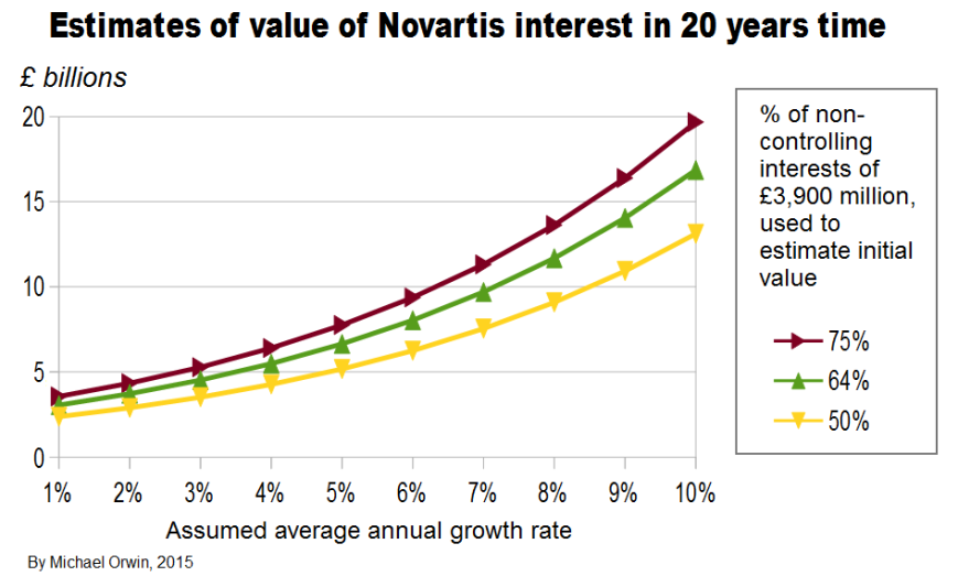
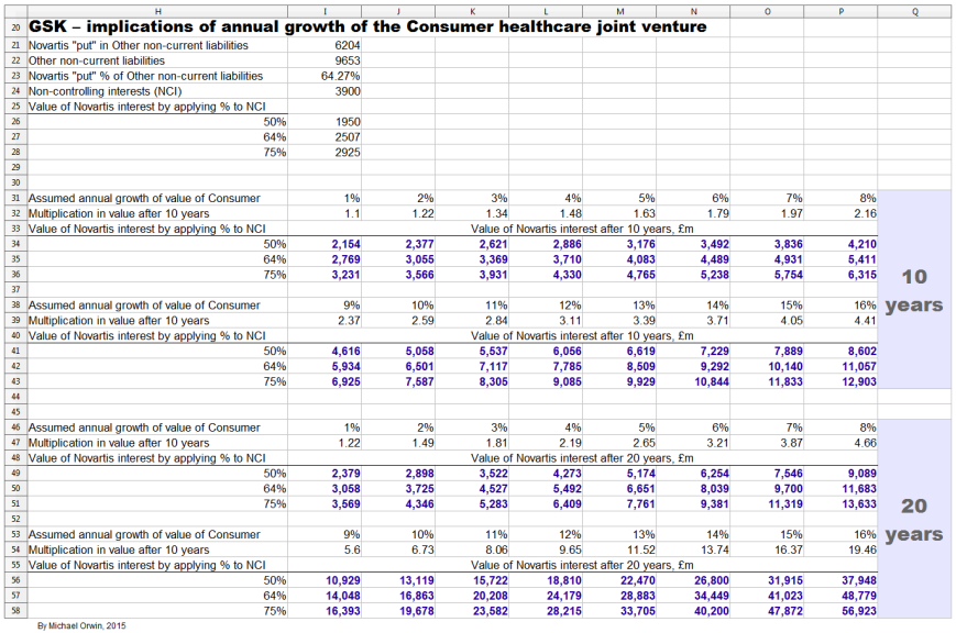
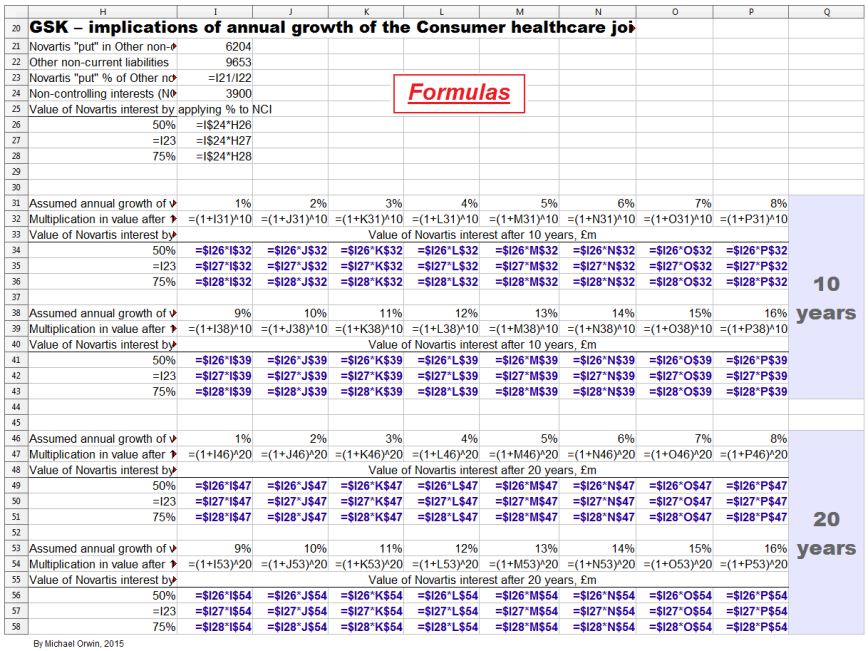
The debt schedule in the 2014 annual report will not be up to date due to the deal with Novartis. It’s under “Contractual obligations and commitments” on page 69. It’s still worth showing, because it shows that most of the obligations did not have to be paid in the next five years. The totals (as at year end 2014, in £ millions, not broken down by type) are –
Total ~ Under 1 year ~ 1 to 3 years ~ 3 to 5 years ~ > 5 years
37,952 ~ 4,744 ~ 6,137 ~ 5,300 ~ 21,771
It’s something to check when the 2015 report is published. See also the bar chart for “Maturity profile of gross debt”, which gives more detail but without figures. In the 2014 report the chart goes up to 2045, when very roughly £800 million is due.
Pensions
GSK closed its defined benefit pension plan to new entrants in 2001, going by –
“Sir Andrew Witty is a member of the Glaxo Wellcome defined benefit pension plan with an accrual rate of 1/30th of final pensionable salary. This plan has been closed to new entrants since 2001. The section of the plan that Sir Andrew is a member of provides for a normal retirement age of 60 and a maximum pension value of 2/3rds of pensionable salary. Since 1 April 2013, pensionable earnings increases are limited to 2% per annum for all members, including Sir Andrew.” (Annual report for 2014)
Many big companies closed such plans, because of rising life expectancy, and falling stock markets (in the UK, many companies withdrew supposedly surplus funds from schemes as stock investments rose in the 1990s).
While actuaries ought to be giving unbiased estimates of the eventual cost, that does not rule out the estimated liability increasing. From a table in the annual report with the heading “Movements in defined benefit obligations”:
(£ millions)
Pensions ~ Post-retirement benefits
Obligations at 1 January 2012
(14,334) ~ (1,616)
Obligations at 31 December 2014
(17,801) ~ (1,397)
The pensions obligation grew by £3,467 million in three years, an average of £1,155.67 million per year. Taking that average rise as a percentage of profit after tax –
2012 ~ £1,156 million is 24.7% of £4,678 million PAT
2013 ~ £1,156 million is 20.5% of £5,628 million PAT
2014 ~ £1,156 million is 40.8% of £2,831 million PAT
I don’t mean to imply that the pension obligation will keep growing by £1.2 billion a year, just that past experience shows the potential for it to grow a lot, unless the possibility can be disproved. In the annual report for 2007, the “Present value of scheme obligations” for pensions was 10,338. That implies an increase of 17,801-10,338 = 7,463 over seven years, an average of 1,066 per year, slightly less than the 1,156 average increase since January 2012 (in £ millions).
Taking the seven year average of 1,066 per year, at 4,835 million shares, that’s an average annual increase of 22p per share in the pension obligation. While the actual increases subtract from Other comprehensive income, they must at some point subtract from profit to avoid a pensions deficit from building up. The pensions costs are not excluded from GSK’s definition of free cash flow, and they don’t seem to be excluded from core EPS, except possibly if they’re in the “other adjustments” in “Acquisition accounting and other adjustments”.
(£ millions)
2014 ~ 2013 ~ 2012
Remeasurement (losses)/gains on defined benefit plans
(1,181) ~ 847 ~ (685)
That cost is in Other Comprehensive Income.
Pension and other post-employment costs
403 ~ 170 ~ 95
Most of the above cost is:
Defined benefit schemes (pension and healthcare)
371 ~ 138 ~ 51
As a percentage of profit after tax, the cost of Defined benefit schemes was 1.1% (2012) and 13.1% (2014).
From “Pension and other post-employment costs” to here, the costs don’t include the remeasurement losses. They are spread between Cost of sales, Selling, general and administration, and Research and development. There would generally be a remeasurement loss in OCI either before a sustained rise in the costs hitting the income statement, or at the same time (similar to the way an insurance company increases its reserves to reflect more insurance losses than previously expected).
The estimated pension liability is based on long term assumptions which are revised each year. For the UK, 2014 only:
Rate of increase of future earnings 2.00%
Discount rate 3.60%
Expected pension increases 3.00%
Inflation rate 3.00%
The biggest number in the sensitivity analysis is the £645 million extra liability for a 0.25% decrease in the discount rate. That should work in GSK’s favor if interest rates rise.
Assumed life expectancy beyond age 60, projected for 2034, ranges from 28.7 years (male, USA) to 32.2 years (female, UK). I expect GSK’s actuaries know their job, but it isn’t completely clear to me that the projections are for people with a good pension and post-retirement healthcare (where relevant), rather than just the average life expectancy.
From the sensitivity analysis, each extra year of life expectancy costs GSK an estimated £57 million.
An employee review on glassdoor complained about management being old (and having conservative attitudes). Old management who have been employed long enough to be in the defined benefit scheme are not likely to leave.
Maybe I should just trust the actuaries, but I can’t rule out the assumptions proving to be too optimistic. That would not immediately increase the cash paid out, but at some point higher future costs have to be recognized as non-cash charges, which the market would probably not ignore. At some point the obligation has to stop rising. When a scheme member retires, at least they stop accumulating pension rights.
Rising life expectancy is good for business, assuming elderly people continue to need medication. However, big old companies with legacy defined benefit schemes will generally be at a disadvantage relative to younger companies with no such liability, or from the expense angle, without the hit to Cost of sales, SG&A and R&D.
Credit ratings
The “put” obligation to Novartis is one reason given for a downgrade from Moody’s of the long-term credit rating to A2. More recently Moody’s changed the outlook, see “Rating Action: Moody’s changes outlook on GSK’s A2 issuer rating to negative” 29 May 2015 (moodys.com). There’s quite a lot of detail in their “ratings rationale”, most of it not cheerful reading for shareholders, but it’s the job of a ratings agency to consider what could go wrong rather than what might go right. The most positive opinion is about liquidity, due to GSK’s cash and a revolving loan. The cash balance in the Q3 results is £5,908 million, about 43% less than the figure in the Moody’s piece.
On Market Realist, find “credit ratings”, and you’ll see two A grades for the long-term credit rating. See also “GlaxoSmithKline plc Earns A+ Credit Rating from Morningstar (GSK)” by Mark Watkins, November 4, 2015 (dakotafinancialnews.com).
Legal proceedings
There are five pages about this in the annual report for 2014 which you can find with “45 Legal proceedings” (“45” as in “Note 45”). I don’t go into a lot of detail here beyond reproducing headings to give some idea of the range of legal proceedings.
Intellectual property
Avodart/Jalyn
Benlysta
Epzicom/Trizivir/Kivexa
Lexiva
Product liability
Avandia
Paxil/Seroxat and Paxil CR (relating to pregnancy, and attempts to commit suicide or acts of violence)
Poligrip
Sales and marketing and regulation
China investigation
SEC/DOJ and SFO Anti-Corruption enquiries
US State Sales and Marketing Investigations
Average wholesale price
Cidra third-party payer litigation
Anti-trust/competition
EU sector enquiry
UK Competition and Markets Authority investigation
Securities/ERISA class actions – Stiefel
Commercial and corporate
Environmental matters
About “Intellectual property”, like most big pharma companies, GSK don’t have high product concentration, except for Advair which is off-patent anyway. The next table uses the figures under “Pharmaceuticals and Vaccines turnover by therapeutic area 2014” in the annual report for 2014. It presumably excludes OTC because the total is less than group “Turnover” of £23,006 million.
Drug (D) or Vaccine (V)
2014 Sales (millions) ~ 2014 Sales % (my calculation)
Total drugs and vaccine sales
£18,670
Seretide/Advair (D)
£4,229 ~ 22.7%
Infanrix/Pediarix (V)
£828 ~ 4.4%
Avodart (D)
£805 ~ 4.3%
Epzicom/Kivexa (D)
£768 ~ 4.1%
Legal and patent status –
Seretide/Advair ~ no disputes, off patent (see note)
Infanrix/Pediarix ~ no disputes, off patent USA, expires 2016 Europe (see about vaccines)
Avodart ~ IP dispute, off-patent (so the case refers to past rather than future sales)
Epzicom/Trizivir/Kivexa ~ IP disputes ~ Epzicom/Kivexa expires USA 2016 (combination) and EU 2019 (combination). Trizivir is the same except the EU date is 2016.
I’ve described Advair as off-patent because sales are already declining and the message from management is that generic sales in the US depend on overcoming the difficulty of making the product and getting FDA approval rather than on patent expiration. See “Advair and generics” above for details.
For GSK’s vaccines and OTC businesses, patent disputes are less likely and less serious for the same reasons that the products don’t fall off a patent cliff – difficulty of production, and branding.
The successfuly launched HIV drugs Tivicay and Triumeq are not in the “Legal proceedings” section.
From the Q3 2015 results announcement –
“Legal charges of £72 million (Q3 2014: £318 million) included settlements of existing matters and litigation costs. Legal charges in Q3 2014 included the £301 million fine payable to the Chinese government. Cash payments in the quarter were £43 million (Q3 2014: £341 million).”
R&D day
The R&D event was held on November 3, 2015 in New York, featuring a selection of “assets” in the pipeline (39 “new molecular entities” or NMEs, and 15 new formulations or combinations, known as PLEs). I’ve already quoted extensively from the R&D event documents, but there are a few other points worth making. Patrick Vallance, President of Pharmaceuticals R&D, said before getting to the drugs –
“Publications are a surrogate for how well-connected we are, how well-respected we are in the academic community. Not only do we publish a lot but actually we publish in the very highest quality journals, highest citations, 35 publications annually in the very top journals.”
“I will just highlight one programme and that is the programme we have for chemists, where we have 50 chemists in training doing PhDs whilst being part of GSK. I think the 19th one was awarded last week, but the fellowship schemes go throughout GSK with individuals being allowed to focus on science.”
“One final thing to say about our external advice. We have recently formulated an immunology network to really try and bring in immunology challenge throughout the organisation because it is such a key theme through many of the medicines I am going to talk about and the latest example is actually bringing in six external academic investigators to have labs based inside GSK, not only to challenge, but of course to stimulate and give new ways of thinking, a so-called immunology catalyst.”
The common thread there is communication between company scientists and academia, which I believe increases the chance of getting the best idea from whoever has it. I can’t promise that they all collaborate effectively rather than try to defend silos, or that the initiatives are unique to GSK, but at least management are doing the right kind of thing. Partnership between companies is the norm (as well as suing each other), because microbes are often hit with two or more compounds with different action to make it harder to evolve resistance, and a single company very often doesn’t have all the compounds good enough for a combination.
A slide in the presentation shows a piece of paper, about which Vallance said –
“This bit of paper was a note on which one of our chemists, Brian Johns, in 2005, sitting down with his counterpart from Shionogi, drew some structures of a molecule that he thought they might want to make, and some approaches to chemistry – in this case, trying to look at how they can make a third ring in the molecule close. That was a pivotal step in what then became dolutegravir”
The case shows how ideas can be small enough to fit on a page and powerful enough to underpin a blockbuster drug, while underlining the need for communication and collaboration.
A table in the presentation shows the planned filing dates for the NMEs and PLEs. The filing dates are for New Drug Applications or NDAs, although that’s FDA terminology and GSK did not say that all the filings were with the FDA, so some planned filing dates might be for Europe. In the transcript, “FDA” occurs twelve times and European regulators are mentioned five times. Summing up the numbers for NMEs and PLEs under the planned filing dates –
NME ~ PLE
2014 to 2017
7 ~ 5
2018 to 2020
11 ~ 5
2021 to 2025
21 ~5
Total
39 ~ 15
A third of those were discovered at GSK –
“Of the work you are going to see presented today about a third was discovered by Discovery Performance Units inside GSK and about two thirds are worked on by those Discovery Performance Units, obviously in collaboration with outsiders.”
That’s only for the featured items. A fuller list of drugs and vaccines in the pipeline can be downloaded from the Product pipeline page. New projects in pre-clinical development are not disclosed for competitive reasons, and some project types might not be identified.
See also the quotes under “Upside in the pipeline”, above.
The R&D event was about the science rather than about the commercial potential of the drugs and vaccines profiled. An analyst who asked about the pricing of the Bexsero vaccine in relation to the competition was reminded that the event was about R&D and told to talk to “our Commercial colleagues” in the lunch break. Investors did not have that opportunity and are left with uncertainty about the commercial potential of the pipeline.
For an example of press comment (you’ll need to answer a few survey questions) see “GSK unveils new drugs to boost growth” Andrew Ward, Pharmaceuticals Correspondent, November 3, 2015 (ft.com).
R&D in 2007
The annual report for 2007 had some cheerful reading –
“The best year for pharmaceutical R&D since the merger
2007 saw GSK’s best year for R&D since the Group was formed in 2000. We have undoubtedly made great strides in the last seven years – but there remains more to achieve and more benefits which we can look forward to as our investment in the pipeline delivers.
During the year, three new chemical entities and one new vaccine were approved; Veramyst for allergic rhinitis, Tykerb for breast cancer, Altabax for skin infections and Cervarix to prevent cervical cancer.
We have progressed a range of products through the pipeline, positioning us well for the future. A total of nine new phase III programmes started. These are the large scale trials where we seek to ascertain safety and also to prove unequivocally the efficacy of the medicines before submitting them for approval.
Our initiative to in-license potential treatments continued. We brought three new late-stage programmes into GSK and moved a further four into late-stage development, improving our ability to reload and sustain the pipeline we need. By its nature, R&D carries inherent risk. We were pleased that 2007 was a year of few disappointments, with the most notable termination being that of odiparcil, to prevent blood clots. A number of product line extensions were delayed which we had hoped would gain final regulatory approval in the USA, including Lamictal XR and Requip XL.”
I read about an old efficiency drive with a growing sense of deja-vu –
“In October 2007, GSK announced a significant new £1.5 billion Operational Excellence programme to improve the effectiveness and productivity of its operations. This new programme is expected to deliver annual pre-tax savings of £700 million by 2010. GSK expects to realise the majority of annual savings within the first two years of the programme, with approximately £350 million expected by 2008 and £550 million by 2009. These savings will partly mitigate the expected impact to 2008 earnings from generic competition and lower Avandia sales and the associated adverse impact on GSK’s gross margin.”
Find “Basic earnings per share were 82.6p, 95.5p and 94.4p in 2005, 2006 and 2007” above, so you can see the figures above a chart for 2012 to nine months 2015. EPS has been volatile recently, so I’ll give core EPS for 2014 which was 95.4p, and for nine month 2015 it was 57.7p. I have not checked for corporate actions since 2007 that might have skewed the comparison, but the steadily increasing dividend and steadily decreasing share count suggest there hasn’t been anything drastic. My point is that the “best year for R&D” and “more benefits which we can look forward to as our investment in the pipeline delivers” in the 2007 report did not translate into EPS growth. The CEO started in May 2008.
Cervarix failed commercially in the US, find “with this vaccine is because we were late”, below.
The vaccine alliance
GAVI is a broad alliance which promotes the accessability of vaccines. Poor countries get cheap vaccines under a GAVI agreement. Now GSK has frozen prices for ten years for any previously qualifying country that gets too rich for GAVI, see “GSK extends its price-freeze commitment to ten years for countries graduating from Gavi support” January 26, 2015 (gsk.com). I’ll quote –
“Four of every five of GSK’s vaccines are provided to developing countries at a substantial discount to western prices. We offer our lowest prices to Gavi which can be as little as a tenth of developed world prices. At these levels, we are able to just cover our costs, which is key to making our GAVI offer sustainable. We continue to look at ways to reduce production costs and any savings we make we will pass on to Gavi.”
The good news in the statement for the vaccines business is that when prices just cover costs and are a tenth of developed world prices, it implies a 90% margin over production cost in the developed world, though like drugs there needs to be a sufficient mark up on production cost to give a reasonable return on the investment. The 2014 annual report has “Investment decisions are rigorously benchmarked using a Cash Flow Return on Investment (CFROI) framework.”, but I have not seen any CFROI figures disclosed, for vaccines or anything else.
Vaccines sales and supply
Orders and payment are lumpy for vaccines, causing short term variability. About supply constraints –
“if you look at Vaccines in the short-term we’re bumping up against some capacity constraints.” (Financial outlook and guidance, May 6, 2015, transcript).
That seems to be mostly resolved. From the Q3 2015 results transcript –
“Progress is evident in a number of areas” … “in our supply chains, particularly Vaccines and Consumer, where the investments we have made to improve capacity and reliability allowed us to move early on the important seasonal businesses of flu vaccines and cough and cold in Consumer, creating the opportunity to take share and improve pricing, delivering a significant step up in profitability and growth as a result.”
“Vaccines were at £1.2 billion, up 13%, reflecting continued progress of our new meningitis franchise and a strong performance in the US, which also benefitted from sales of flu vaccine.”
However, from the same transcript –
“Hepatitis sales were down 15% mainly because of the supply constraints that we have previously talked about.”
“We continue to make investments in the supply chain to improve overall reliability and expand capacity for the future, but it will take into 2017 before the programme is fully complete.”
Barriers to entry in vaccines
The significant barriers to entry and the lack of a patent cliff are worth quoting extensively. From GSK’s transcript for the Investor Event, May 6, 2015 –
“we have been investing substantially in our capital base, especially in the Vaccine business, and you will hear a little more about that. This remains a highly capital-intensive industry, there is no doubt that is a barrier to entry, which is why there are only four global Vaccine companies. That is an area on which we shall continue to focus.”
Some capital-intensive industries such as steel making are cyclical and destroy capital. Fortunately there’s more to vaccines than high capital needs.
“If I take pneumococcal vaccine that we have developed, Synflorix, we invested almost £400 million before we had the first Phase III data available to us.
Complexity of manufacturing is another very significant barrier. If I take again Synflorix, it takes 24-28 months to release a batch. It takes 550 quality control checks before you are able to release a batch. Trust me, you have 550 opportunities to fail your batch; very complex.
Finally, combination vaccines are very important. If you take infant vaccine, combinations are a critical means to enhance coverage through immunisation and in the pertussis area. If you don’t have five or six vaccines combined in one shot, you can’t enter the game. Significant financial portfolio and technical barriers to entry, which explains why there are very few players and very few players are able to enter this game.”
“in contrast to the pharmaceutical industry there is no patent cliff, there is no cliff upon patent expiry. The vaccine business is a very long term, very sustainable business where life-cycle management plays a very important role. As a consequence for that, for instance, if I take our R&D budget in GSK Vaccines, about 50% is allocated to active life-cycle management and the other 50% to new product discovery and development.”
Life-cycle management is about expansion beyond the initial geographic area and the initial indication, and improving the manufacturing. As an example of a new indication for an existing vaccine –
“so this is news – Phase III data with our flu vaccine, quadrivalent, in the paediatric, six-month old population, where we successfully completed the Phase III trial and will be filing for this indication in 2016 here in the US.”
Manufacturing improvements include new formulations, better manufacturing reliability, and lower cost of production.
Vaccines breakthrough
Vaccines work by injecting substances which look like a pathogen to the immune system, while being harmless or much less harmful (attenuated). They are frequently combined with an “adjuvant” which is not a vaccine but enhances the effect, and adjuvants can vary in form from aluminum to an oil in water immersion. A problem with vaccines is they usually have less effect in the elderly. GSK have an adjuvant which they claim will make many vaccines effective in elderly people. About the Shingrix vaccine for shingles –
“A second point about this vaccine is about the adjuvant formulation, AS01. We believe that this is a breakthrough in vaccinology: all elderly vaccines have moderate efficacy, whether it is flu, or pneumovax or others, and it’s having an adjuvant formulation like AS1 that will allow us, or will enable the feasibility of a number of elderly vaccines. I will be describing to you one of those, but there are more to come.” (R&D event transcript)
About shingles, most people have zoster virus (aka “cow pox”) without it doing any harm, but the risk of it causing shingles increases from age 50 to about 80 to 90. A severe complication of shingles called post herpetic neuralgia is a leading cause of suicide in the elderly.
Shingrix passed Phase 3, see “GSK’s candidate shingles vaccine demonstrates 90% efficacy against shingles in people 70 years of age and over” 27 October 2015. GSK also claim 91% to 97% efficacy compared to 51% for Merck’s Zostavax, in the R&D event presentation. The age groups are probably not identical in that comparison, but GSK claim Shingrix is better in elderly patients due to the adjuvant. Also its storage requirement is “fridge” whereas Zostavax is “freezer”.
An analyst pointed out that GSK were the only company not to get a pandemic vaccine approved in the US a few years ago, because of the adjuvant. The reply described the variety of adjuvants and their safety profiles. The adjuvant in question is suspected of causing narcolepsy. Other adjuvants have well established safety profiles, and –
“The very same adjuvant formulation AS1 has been in thousands of newborn babies as a malaria vaccine in a population where health is fragile in sub-Saharan Africa, again with a very good safety profile. We feel confident that this vaccine adjuvant is very safe”
About the failure of Cervarix in the US, it was not due to the adjuvant. GSK’s failure …
“… with this vaccine is because we were late. I believe that if we had been first, it would have been very difficult to displace a cancer vaccine with a genital wart vaccine. That is how things unfolded but I just wanted to correct the perception that the adjuvant formulation has anything to do with the performance of that vaccine.”
I don’t doubt the replies, but there have been failures in vaccines which management would not have mentioned if it wasn’t for those pesky analysts.
Meningitis B vaccine
Vaccines for meningitis B have been approved without the usual proof of efficacy, because the unpredictable incidence made Phase III trials impractical. GSK’s Bexsero was approved in Canada and used in the Saguenay Lac province of Quebec, with 55,000 people aged two months to 20 years immunised between March and May of 2014. The cases of MenB stopped. Within a year there were two cases, both from people who had moved in from other provinces. GSK claim that data from the province shows Bexsero is the only meningitis B vaccine with effectiveness data in real-life use.
The UK has started vaccinating 700,000 children a year with Bexsero. If the success in Saguenay Lac is repeated, data from the UK should give GSK a strong case for approval in the US –
“That study will read out in 2019 and will inform our decision to fight for this indication in the US and also, importantly, as happened with meningitis C in the 1990s, should inform other countries’ decisions for implementation of universal mass vaccination in their paediatric population.”
Respiratory syncytial virus (RSV) vaccine
Respiratory syncytial virus (RSV) is highly infectious and affects infants and the elderly. GSK’s RSV vaccines are at an early stage with a Phase 3 study not expected to start until 2019. In infants RSV can cause pneumonia and bronchiolitis and can be a factor in the development of severe asthma. A problem in vaccinating against it is that babies can get the infection before their immune system is developed enough to benefit from vaccination. GSK’s solution is two vaccines, the first is to vaccinate pregnant women with, and the baby retains enough antibodies to provide protection for three to four months, by which time it can be vaccinated with the second vaccine.
An RSV vaccine in the 1960s did more harm than good, probably by inducing the wrong kind of inflammation, wiping out lung tissue as well as the virus. GSK believe they have overcome the problem, but the details are fairly technical. About the infant (not maternal) vaccine –
“We believe that we have a new platform immunisation technology in the form of a replication-defective chimpanzee adenovirus vector that we acquired from a biotech company called Okairos in 2013 that is able to induce that type of T-cell response, in fact this vector has been, in clinical trials in neonates with a malaria vaccine candidate and shown to be safe and able to induce the right T-cell responses. It is also the vaccine vector that we use in our Ebola vaccine, that, as you know, is in Phase III trials in a few thousand individuals.”
“Everybody is expressing – including ourselves in the past – what is called the Post-Fusion form of glycoprotein F, we have been successful and we have proprietary protection around it in expressing what is called the Pre-Fusion form of glycoprotein F.”
The “Pre-Fusion” form absorbed about 85% of the neutralising antibodies in a serum from an infected person, which means they look like RSV to the immune system. The “Post-Fusion” form only managed about 15%.
The term “new platform immunisation technology” suggests wider application than RSV, and the Ebola vaccine is mentioned, but if there were strong prospects for wider application it’s likely that more would have been said.
I’m not sure how Dr Moncef Slaoui can say the programme is “very high risk” while the vaccine will “undoubtedly” be recommended across the globe –
“We believe that this is the most credible vaccine in the industry against RSV, this is a very high risk programme, but this is also a very high reward programme. I believe that the vaccine against RSV will undoubtedly be a vaccine universally recommended across the globe for immunisation in infants, because of the incidence and importance and severity of the disease.”
Vaccinating COPD patients
GSK describe “A new vaccine concept” for chronic obstructive pulmonary disease (COPD). COPD is the result of irreversible lung injury caused by exacerbation episodes, which are often associated with lung infections. Two kinds of bacteria cause 30% to 50% of the infections that lead to exacerbation episodes (nontypeable haemophilus influenza and moraxella catarrhalis).
A vaccine against the first infection has completed Phase 1 and Phase 2 studies in a healthy elderly population. If further studies are successful, an antigen will be added for the second infection. COPD particularly affects elderly patients, and the previously mentioned adjuvant AS01 is used with the vaccine. Vaccination would be for COPD sufferers to prevent further infection from causing more lung damage. Filing for the COPD vaccine is not expected until after 2025.
Benlysta
Benlysta is for Systemic Lupus Erythematosis (SLE), a chronic immuno-inflammation disease affecting musculoskeletal, haematological, cutaneous & renal systems, resulting in poor quality of life. It’s a kinase inhibitor which is good at hitting it’s target (RIP1 kinase) with very little ‘collateral damage’ to anything else. Benlysta was developed by GSK and Human Genome Sciences, and received FDA approval in 2011.
“when Benlysta was approved it was the first medicine for 50 years; if you look at the number of other people who have tried in SLE, there have been three other failures in Phase III from other compounds in SLE, so the fact this has hit again on a third pivotal study is not chance, it is actually a rather important observation.”(R&D event transcript)
Benlysta doesn’t outperform the placebo massively. For “Proportion of patients with SLE Responder Index (SRI) response at week 52”, it’s placebo 48.4%, Benlysta 60.8%, however the placebo is actually a high standard of care, not a sugar-pill. The statistical significance of the higher responder index is given by “p=0.0011”, which means if there was no real advantage over the placebo, there would only be 1.1 chance in 1,000 of getting results that good.
“first medicine for 50 years” is an achievement. Benlysta could move beyond Lupus (“subcut” is subcutaneous, or under-the-skin) –
“so definitely hit the target, got a nice molecule and got the potential to go into multiple areas where you have not only inflammation, but you have cell death driving the inflammation.”
“I think Benlysta with the subcut has the potential not only now to move into a different population, in terms of more people wanting to use this, but also in terms of different diseases that we are looking at and we will be filing for this very shortly, either at the end of this year or the beginning of 2016.”
“So we are going to go next year into parallel early experimental medicine studies, rheumatoid arthritis, ulcerative colitis and psoriasis. We will pick early from these”
A patient who suffered the effects of autoimmune B-cells had not responded to rituximab or Benlysta alone, but responded dramatically when both were given. Rituximab knocks out B-cells, and the bone marrow makes more of them. The theory is that in the presence of Benlysta, the new B-cells were not autoimmune, and if that’s right, maybe Benlysta could be used to reset a faulty immune system. GSK will be exploring the effect in a clinical study starting in 2016.
Amyloidosis
Amyloidosis is a disease where proteins don’t fold properly and they accumulate in tissues, including vital organs and nerves. One approach is to switch off the protein production. There’s a more novel approach which depends on a hypothesis from an academic GSK are working with. The theory is that the amyloids get a coating which stops them from being “phagocytosed”, which means the body’s garbage removal system doesn’t touch them. The approach based on that hypothesis is to make the coating (serum amyloid P) visible to macrophages so they can “throw out the trash”, although I’ve skipped some detail.
I’ve described a few vaccines and drugs I found interesting, but the selection misses out a lot, including all of oncology.
Openness
From GSK’s Data transparency page –
“Back in 2004 we introduced our publicly accessible Clinical Study Register online – a place where we could post information about the clinical research we carry out on our existing medicines, and also the ones that we are developing. We were the first pharmaceutical company to do this.”
Most media stories are positive about this, but not “Transparency measures forced on pharma” by Nuala Moran, 30 September 2014 (rsc.org/chemistryworld). The piece acknowledges cases where avoiding a conflict of interest is bad for communication and cooperation.
In “Drug firms far from transparent with trial data watchdog group finds” by Douglas W. House, SA News Editor, Nov 12 2015 (seekingalpha.com), GSK came out well.
“Trial on antidepressant neglected suicide attempts” is about an antidepressant which was reported to be safe and beneficial for adolescents, after a clinical trial in 2001. The claims became controversial, and it was possible to re-evaluate the drug because GlaxoSmithKline made the data available. It turned out there was no benefit to adolescents, and there were eleven cases of attempted suicide or self harm in the trial, compared to just one in the control group. It’s shocking that the data was originally interpreted in such a biased way, but good that the data was opened up.
Public discussions about not keeping Established Products and ViiV
For Established Products and ViiV, management decided to publicly discuss whether or not to hold on to the businesses, so they could involve shareholders as well as banks and potential buyers. That was democratic, but while the discussion was taking place, “expectations of the HIV new products literally almost grew exponentially as the product began to launch” (Q3 2015 results transcript). Discussing the ownership of ViiV could be seen as either a lack of leadership or a lack of confidence in ViiV. Established Products are described as “very distributed” and “the complexity of extraction is very, very material”, making discussion about divestment seem pointless.
Partnering with Pfizer’s POD
There isn’t a lot left to say after giving the title for this press release from Pfizer – “Pfizer Announces Collaboration with GSK on Next-Generation Design of Portable, Continuous, Miniature and Modular (PCMM) Oral Solid Dose Development and Manufacturing Units” October 29, 2015. Pfizer already have a prototype “POD”. The PODs take up less space than conventional production equipment for solid pills. The same PODs can be used for development, clinical trials and commercial manufacturing, and are set up in about one year rather than two or three. GSK’s input is their “experience and expertise in continuous processing”. I found no news about it on GSK’s website, and I expect they’ll be the minor partner, but it’s still good for them to be involved.
Partnering with Zymeworks
“GlaxoSmithKline partners with fast-growing Zymeworks in $440M-plus deal” by John Carroll, December 3, 2015 (fiercebiotech.com). Zymeworks have technology relating to antibodies, and proteins that last a long time in the bloodstream. The $440 million is potential milestone payments, and there was probably an up-front payment as well. Other big pharma companies have already cut deals with Zymeworks so there’s no reason I know of to expect the deal to give GSK a competitive advantage.
The Trans-Pacific Partnership trade deal
The TPP (Wikipedia, find “Cost of medicine”) has implications for pharma companies. For biologics, see “TPP trade deal: Even more bad news for biotech industry” by Laura Lorenzetti , October 5, 2015 (fortune.com). The agreement includes a common patent life for biologics which is much shorter than in the US currently. The rules are complicated, and companies can choose between two schemes, but complaints from bio companies point to the overall effect (they probably underspent on lobbyists). Possible effects include less investment in biologics, and higher prices over a shorter span in the US. However, biologics are generally hard to copy, so the effect might not be as big as the complaints suggest.
MSF (aka Médecins Sans Frontières or Doctors Without Borders) are concerned “about the inclusion of dangerous provisions that would dismantle public health safeguards enshrined in international law and restrict access to price-lowering generic medicines for millions of people”, see “Statement by MSF on the Official Release of the Full Text of the Trans-Pacific Partnership Trade Agreement” November 05, 2015 (doctorswithoutborders.org).
There’s also the Transatlantic Trade and Investment Partnership (TTIP) with implications for the UK’s National Health Service (NHS) and clinical trial data, according to The Independent, “What is TTIP? And six reasons why the answer should scare you“. TTIP is still being negotiated and agreement seems difficult because EU member countries can veto it.
Industry problems
When I blogged about Gilead, I said that many of their problems could affect other successful pharma companies, partly depending on circumstances. One problem is pressure to cut or contain costs, from governments or other large buyers. Competitors might develop superior products, or products good enough to keep the margin down. Competitors, buyers and activists can challenge patents. There’s competition from generic copies (at least for small molecules) when patents expire, unauthorised sales from producers in emerging markets, and sales on Alibaba. There’s also uncertainty over the future of “Obamacare” and the effects if it’s stopped.
As the low-hanging fruit is increasingly picked and effective high volume therapeutics go off patent, at some point the remaining opportunity will increasingly be in rare diseases and personalized medicine. We are still some way off from having problem free cures for every major disease, but in the long run it’s a problem for pharma companies, except those specializing in rare diseases or aiming to commercialize personalized medicine.
Glassdoor reviews
The employee reviews are here (glassdoor.co.uk). They are mostly quite good. IMO, anyone who has not checked a company by the employee reviews should not be too shocked by the negative comments so long as they are in the minority, as a wide range is usual. There were complaints about bureaucracy and time consuming admin processes, but that’s fairly common for big companies. It’s disappointing that the only review of the US operations is very bad, although it’s common for employees not based in the home country to range from disatisfied to very unhappy. I suggest looking at the US based glassdoor reviews (which I can’t get), although you might be redirected there anyway from the link I’ve given.
For comparison, for AstraZenica there’s enthusiasm for the company’s commitment to science. There was only one complaint about bureaucracy, but quite a lot of complaint about too many reorganizations, and change that either did not happen or took too long, leaving employees feeling insecure about their jobs or the projects they were working on.
For Pfizer, I was redirected to the UK glassdoor. Employees seemed happy and liked the friendly working environment and personal development. The word “bureacracy” was not used but it was implied, and management were criticized for being slow to adapt and too risk-averse to innovate. One employee implied that sites outside the US were isolated. Reviews on the US glassdoor might be a lot more positive.
GSK had the lowest overall score, with Pfizer having the highest, but there was only 0.3 difference (the maximum score is 5).
BBC radio programmes
This is just from memory and therefore less reliable. Using the links to make a methodical transcript would not be respecting the BBC’s intellectual property. You probably have to be in the UK to get the podcasts on the links.
In “Bitter pills” (bbc.co.uk), the CEO was interviewed in 2010. Soon after becoming CEO in May 2008, Andrew Witty realized that no-one was taking reponsibility for killing projects, which meant expensive support for developing compounds that were likely to fail. That’s what prompted the reorganization in into teams for discovery and development, and a policy of axing projects when the evidence was against success.
There’s a recent BBC radio interview with Patrick Vallance, the President of Pharmaceuticals R&D – “Problems of Developing Drugs“. When he held a top university post, Vallance had been a critic of “big pharma” R&D, saying it was too focused on marketing. Having made the transition from science to management, Vallance believes mobility of scientists between academia and industry would benefit both sides, though he emphasised academics moving to industry and back. He doesn’t miss science because he’s immersed in it in a broad way, looking at data or discussing clinical trial setup, for example.
He said about personalized medicine, that the disease names are based on 19th century science, and no one thinks of breast cancer as a single disease any more. While the sub-categories inevitably have fewer patients, understanding a disease, particularly its genetics and biochemistry, increases the chance of success. If a 3% success rate improves to a 6% success rate, it decreases the cost of development per success from $1 billion to $500 million. The effect can be seen in approvals for the industry as a whole. I’ll add that targetting a modern sub-category of a broad “19th century” category improves the chance of a cure, simply because a medicine for a disease is less likely to be effective if the disease is actually a broad category with much variation. If the sub-categories aren’t recognized, then understanding of the disease will be poor.
For some diseases, better understanding has led to a “golden era” of discovery. He mentioned depression and schizophrenia as two ‘non-golden’ cases where the understanding was not so good. I’ll add that much of the progress will be due to Moore’s law (the exponential increase in the power of digital chips), just as the invention and develpment of the microscope gave biology and then medicine a tailwind. When scientific advance opens up new opportunities, there’ll be more companies targeting the same area, the bigger the potential profit (as for hepatitis C). Still my own thoughts, Gilead’s patents relating to HCV have been challenged in some countries on the grounds that they did not add much to the academic research. Similar objections seem likely in other areas unlocked by academia, though maybe in countries that signed up to the TPP agreement, TPP can be used to extract compensation if patents are not upheld.
In malaria research, while thousands of drug candidates had been identified, only two were being followed up, due to the cost. The action taken was to make the data public, under an arrangement where GSK would get a small royalty in the event of development through to sales. I’m not sure of the details, and enforcement without patents seems difficult. Pharma companies tend to avoid malaria because it’s mostly poor uninsured people who get it. None of that is mentioned on “Our fight against malaria” (gsk.com).
I’d guess that Vallance moderated the small team “be like a biotech” policy developed under the previous president, where initially careers were closely linked to the success of the team.
Summing up
Before Andrew Witty become CEO, GSK had a corruption problem, and a reorganisation had not sufficiently addressed the problem of low productivity from R&D. Since then there’s been the continuing drag of reduced returns on R&D throughout the industry, the pension obligation rising by £7.5 billion since 2007, and the burden of paying the dividend and meeting expectations for it to rise, although the special dividend due in April 2016 might look like self harm if cash gets tight.
Bold moves by management include the reorganisation around the “DPU” team structure, ending payments to doctors, ending incentives to sales staff to hit sales targets, leading data transparency, the Novartis transaction, and the consolidation of sites along with big job cuts in R&D. The intention to cut layers of management from the consumer business and increase agility is good. There may be a problem in driving change through the organization, for example if the allegation about the cardio division over-claiming for their projects and pushing poor medications into Phase 3 is true. Also there were complaints about bureaucracy in the glassdoor reviews, but as I said that’s true for almost any big old company.
A key factor for a pharma/bio company to outperform in the long run is efficiency all along the pipeline, by which I mean from generating ideas to commercializing approved products. Efficiency along the pipeline is supported by the quotes under “Upside in the pipeline”, above, but there have also been recent failures. Previous years where FDA approvals looked good in the annual report were followed by a disappointing financial performance.
Low growth of core EPS is projected up to 2020, and unless growth is faster or cash conversion improves, the dividend will be at risk.
The Novartis “put” option represents a complex risk, with GSK having a higher liability the more successful the consumer healthcare business is, plus the liability will increase automatically with the unwinding of the assumed discount rate. On the other hand, if the “put” is exercised and enough has been reserved for it, there will be an increase in shareholders’ equity. One possibility is that GSK will have to reserve more for the Novartis “put” at the same time as the pension liability increases. That would not affect core EPS but would affect the balance sheet and the ability to pay the dividend.
Opinion
If the dividend can be maintained, I see the combination of yield, some EPS growth, and possible upside as being enough to be reasonably attractive. I see quite a big upside through pipeline efficiency, but that’s just my opinion. Other investors could easily give more weight to the negative points and the history of underperformance, and less to management’s recent quotes about FDA approvals. The case won’t be proved until there’s sufficient successful commercialization, but waiting for proof is likely to miss any opportunity.
The high yield suggests the share price is supported by the dividend, not the prospects. If the pipeline really has got more efficient, that could have a substantial effect on the stock price. There has to be some risk that the long-term underperformer won’t turn round, but the approvals record with the FDA suggests to me that GSK will have more to offer than just the current and planned dividend.
My opinions are based on the research you see here, and I don’t claim they’re better than other investors’ opinions.
Some points for investors to consider
• Risk to the dividend
• How good is the pipeline
• The Novartis “put”
• Also, check the table under “Contractual obligations and commitments” when the annual report for 2015 comes out.
I kept the list short. GSK have ten pages of risk factors under the headings Patient safety, Intellectual property, Product quality, Supply chain continuity, Financial reporting and disclosure, Tax and treasury, Anti-Bribery and Corruption, Commercial practices and scientific engagement, Research practices, Environment, health and safety and sustainability, Information protection, Crisis and continuity management, and Third-Party Oversight. A lot could go wrong that I’ve hardly touched on.
A scenario
One possible scenario is that GSK need to reserve so much for the Novartis “put” option that they have to cut the dividend. That’s unlikely to happen in the next few years because the consumer business is not likely to grow in value by a lot in just a few years. Remember, £6.2 billion has been reserved in Other non-current liabilities, while the figure for all the non-controlling interests is much less, at £3,900 million, so some growth has already been allowed for. The risk exists because a lot of growth could happen in the next 20 years, though there could be terms in the agreement which mitigate the risk.
If that scenario happens, GSK would have a controlling interest in a stronger consumer business, and cutting the dividend would be good for the financial position and credit ratings. Income investors tend to ignore the positive side when the dividend is cut, and a sharply lower share price could represent a buying opportunity. Obviously I can’t say in advance what the overall condition of the company would be in such circumstances, except that cash would have to be tight for GSK to cut the dividend. It’s just a scenario, which might never happen.
That’s all. Thank you for reading this.
DISCLAIMER: Your investment is your responsibility. It is your responsibility to check all material facts before making an investment decision. All investments involve different degrees of risk. You should be aware of your risk tolerance level and financial situations at all times. Furthermore, you should read all transaction confirmations, monthly, and year-end statements. Read any and all prospectuses carefully before making any investment decisions. You are free at all times to accept or reject all investment recommendations made by the author of this blog. All Advice on this blog is subject to market risk and may result in the entire loss of the reader’s investment. Please understand that any losses are attributed to market forces beyond the control or prediction of the author. As you know, a recommendation, which you are free to accept or reject, is not a guarantee for the successful performance of an investment.